
Bespoke Artworks & Digital Designs
Bringing organisational stories to life through contemporary Aboriginal art.
- Understanding your story and what matters to you
- Original artwork creation (painted and digital)
- Launch attendance and creative activations
Organisational Commissions
Our purpose is to craft custom artworks that resonate with your organisation's distinct narrative and values. Our bespoke art pieces go beyond decoration; they visually encapsulate your brand’s culture, spirit, and aspirations. The commissioning process initiates with an in-depth consultation to understand your story, mission, and goals, incorporating brand colours, logos, and symbols. Our artist melds these elements with the unique Marrawuy Journeys style to produce an evocative artwork. We offer adaptable licensing for diverse uses, from websites to internal communications. Through art, we support your efforts in fostering an inclusive culture, reinforcing brand identity, and impacting stakeholders.
Contact us for a tailor-made artwork narrating your story.
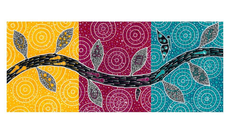
Click through the gallery below to see our past commissions created for organisational clients.
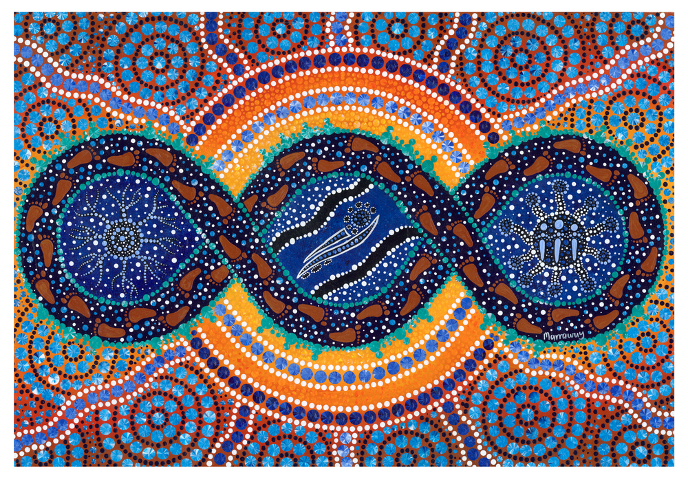

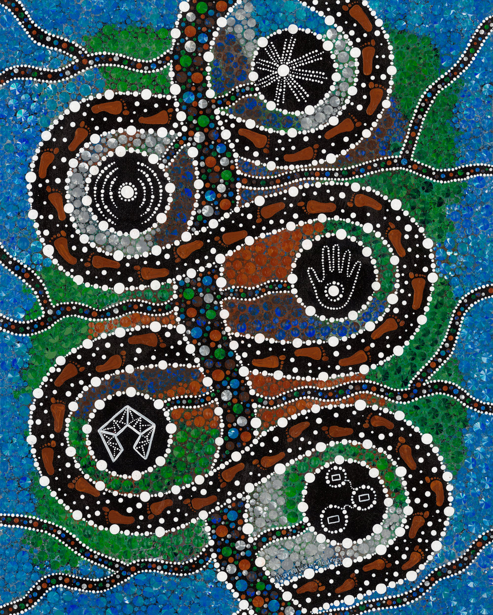
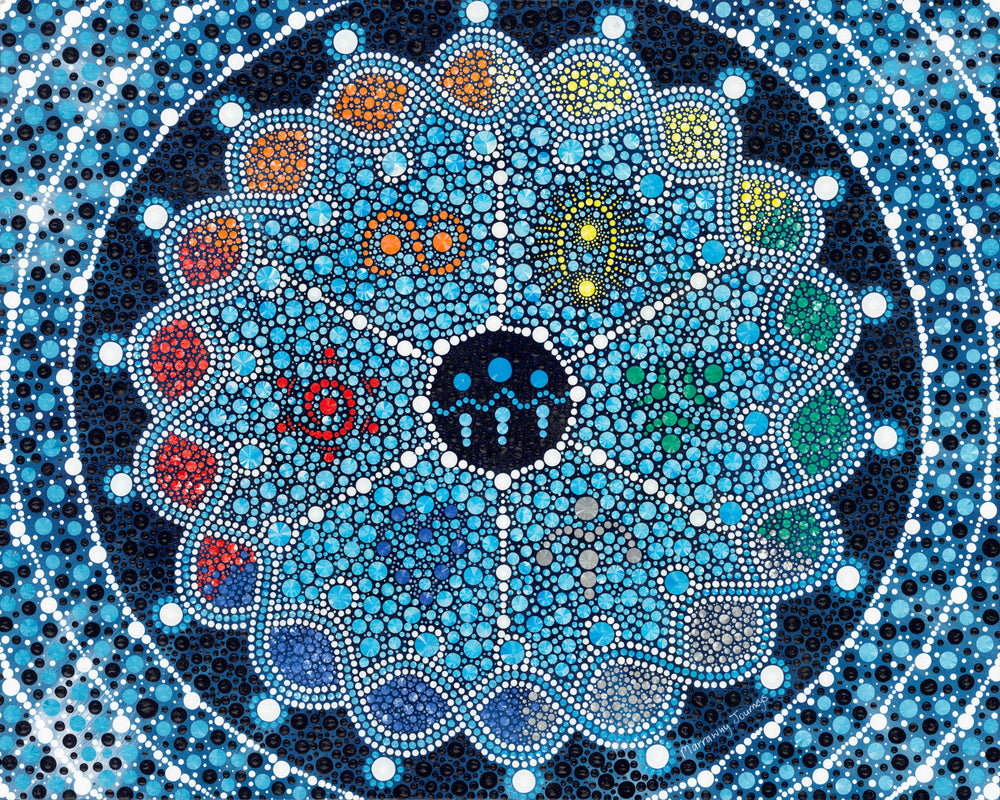
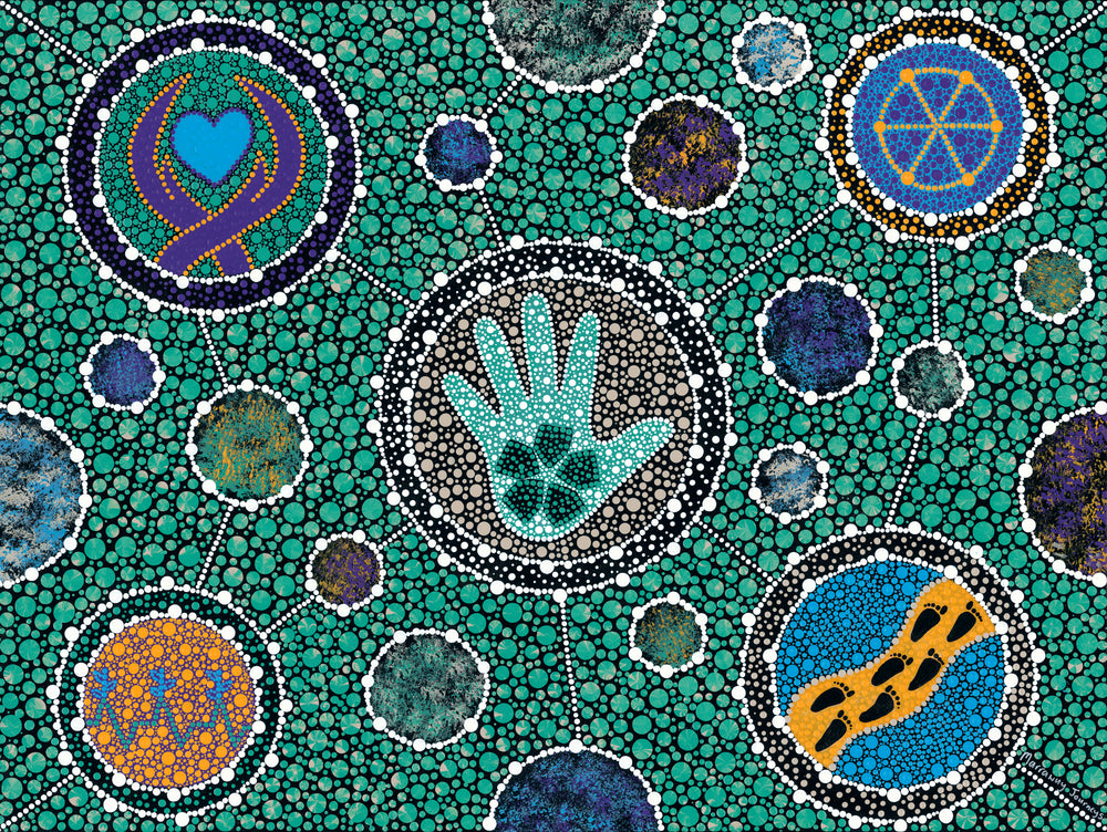
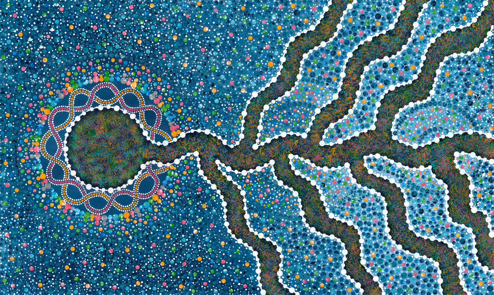
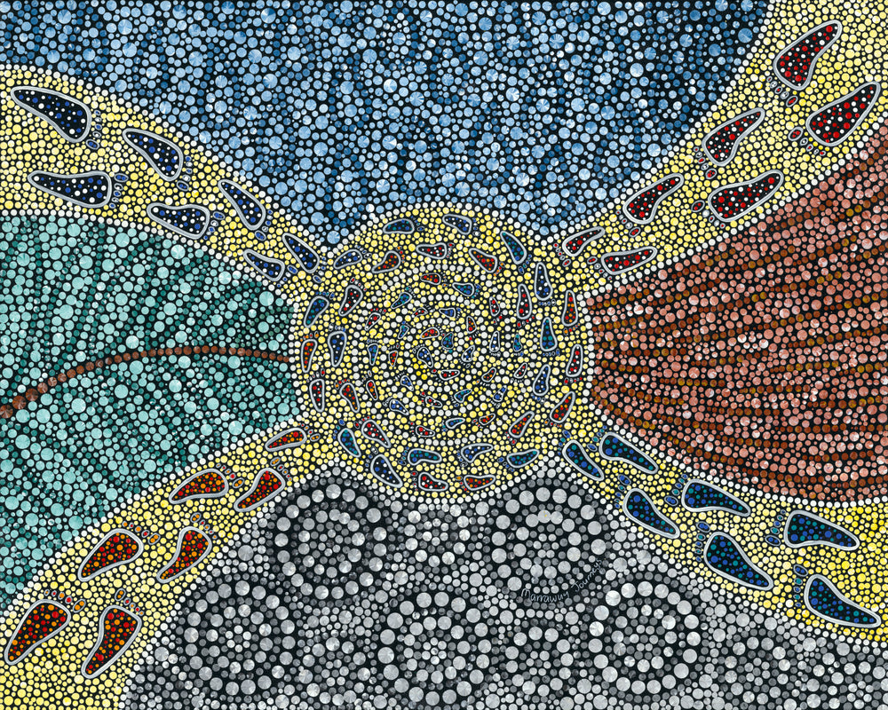
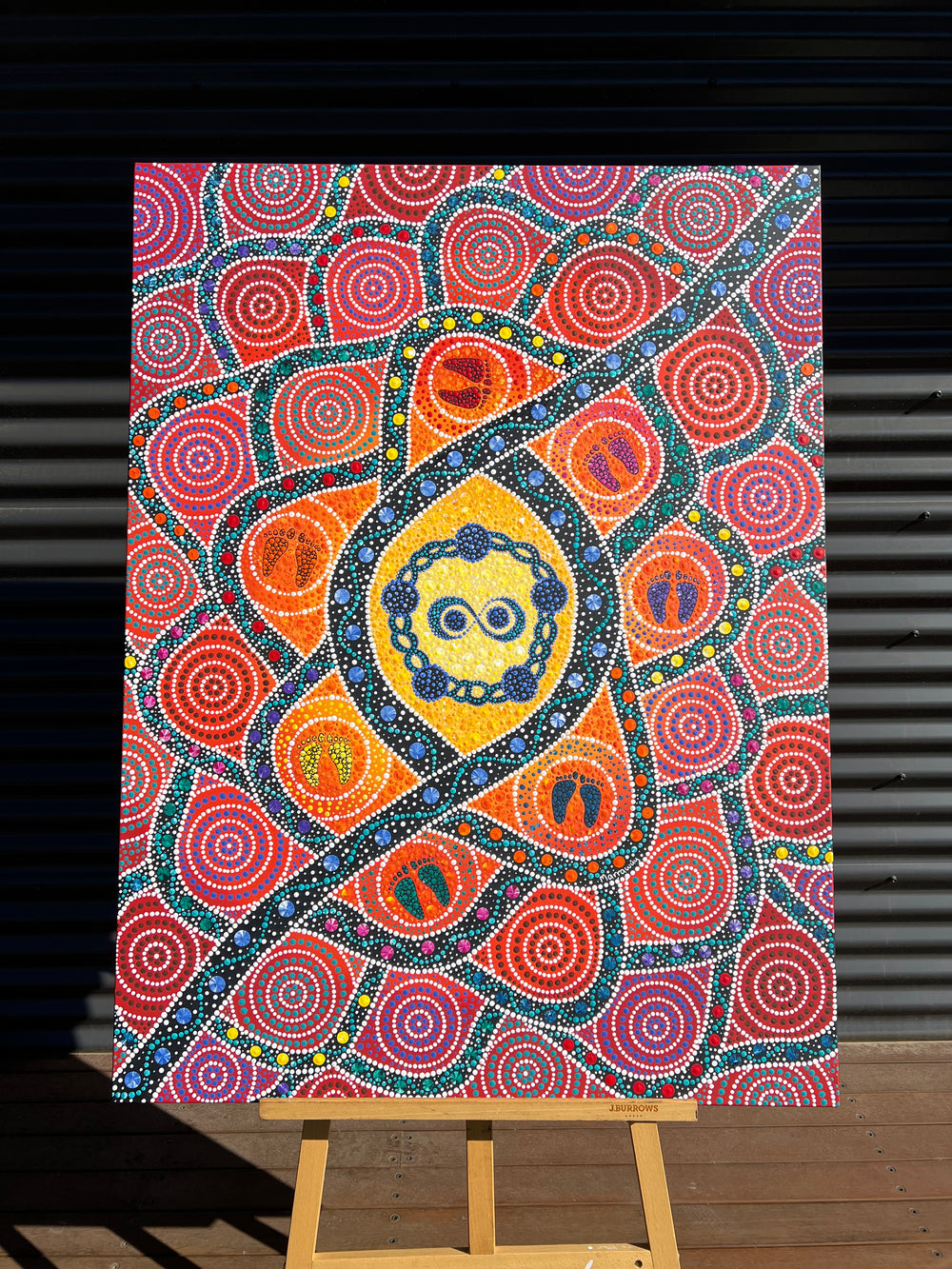
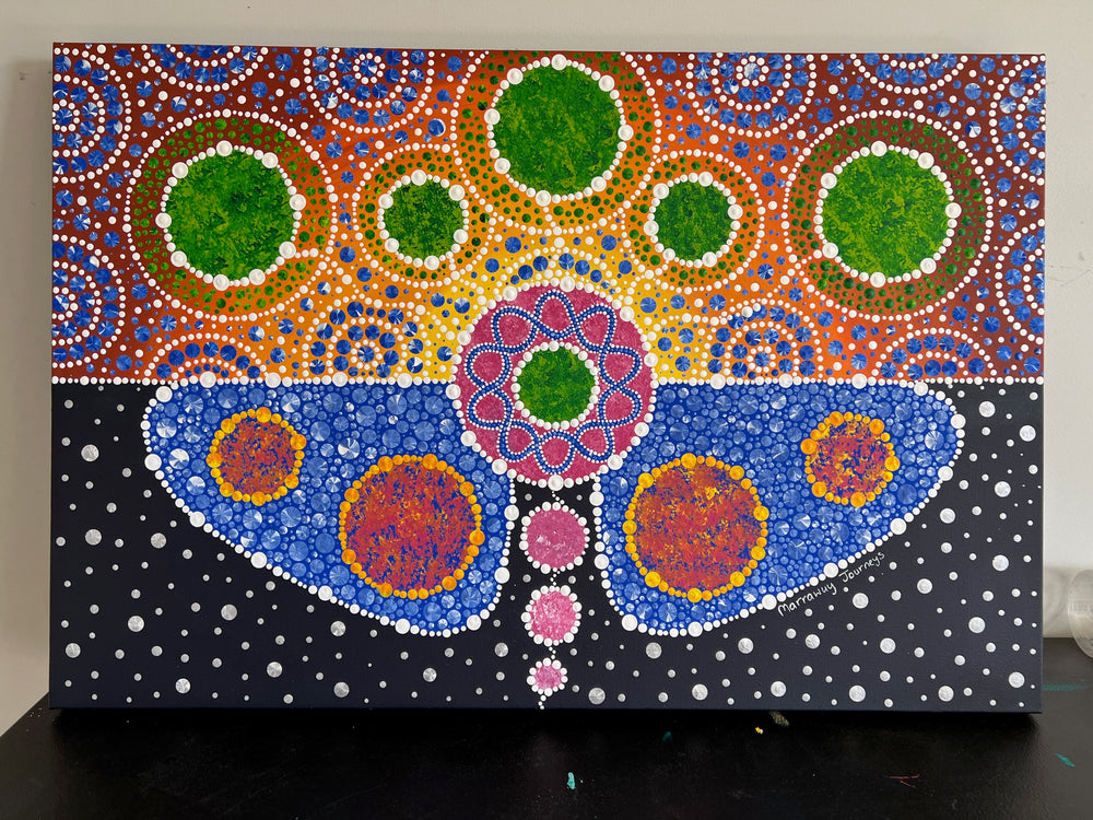
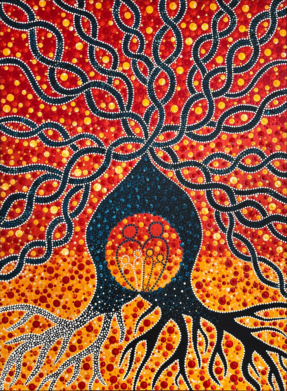
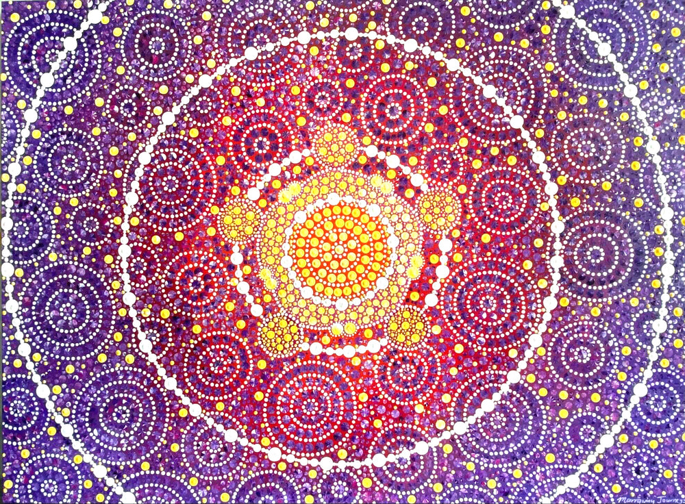
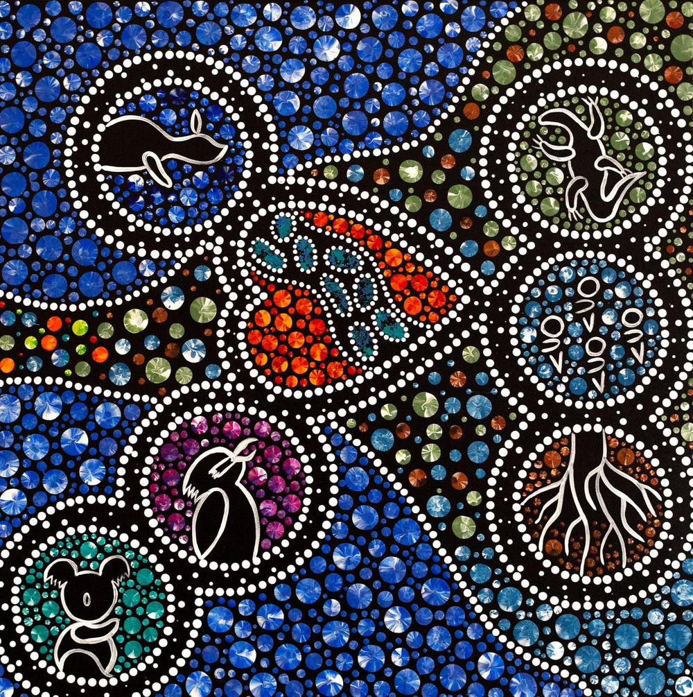
Ripples of Opportunity (22x32 inches) April 2026
Ripples of Opportunity reflects Bundi’s purpose, creating and expanding opportunity through sourcing. It highlights their role in connecting First Nations businesses with global supply chains, enabling pathways for access, capability, and growth.
In the centre circle, the bundi is interpreted as a symbol of sourcing, not just as an action, but as a process of seeking, connecting, and bringing things together with purpose. The interconnected circles on either side represent different parts of that journey. One reflects First Nations businesses looking to grow and expand, while another represents international suppliers, bringing capability and global reach. The central circle brings these together, showing Bundi’s role in connecting opportunity with delivery.
The interconnected pathway of footprints weaving between them represents the sourcing journey itself, with smaller elements representing people, the relationships that underpin everything.
Surrounding the circles, pathways and ripples expand outward, reflecting the broader impact created through these connections. What begins as a single opportunity extends into something larger, creating flow-on effects for communities, businesses, and future pathways.
Ripples of Opportunity reflects Bundi’s role in enabling opportunity through sourcing, where connection and relationships built on trust allow those opportunities to extend far beyond where they begin.
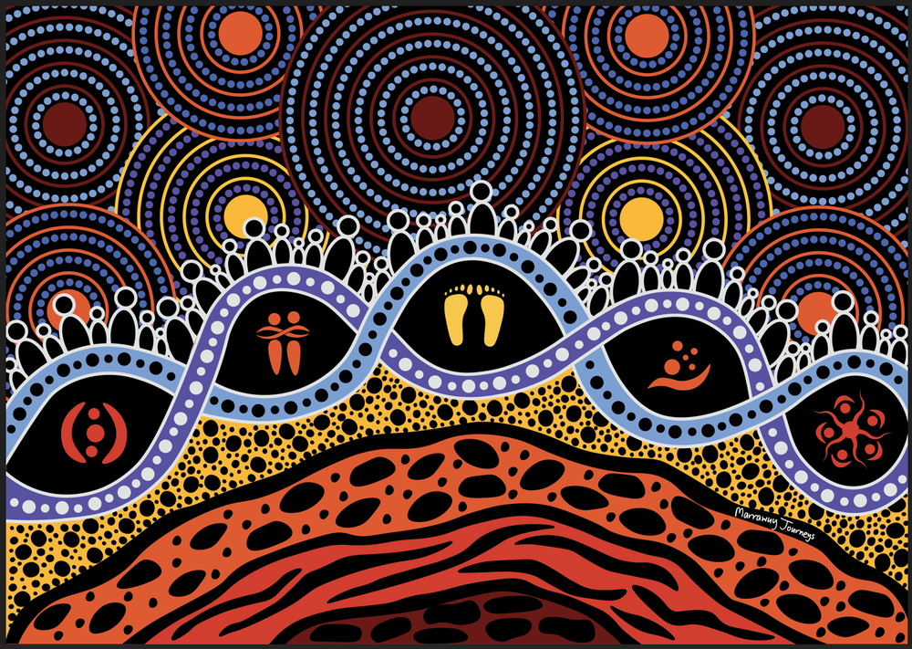
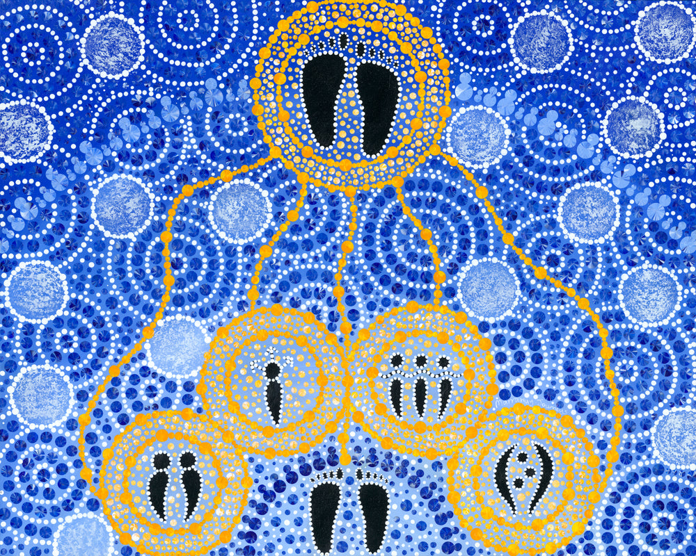
Grounded in Commitment February2026
“Grounded in Commitment” reflects a layered journey. It acknowledges deep foundations, past disruption and the ongoing responsibility of building connection, trust and opportunity together.
At the base of the artwork are earth layers inspired by rock, clay, gravel and sand. These layers represent pre-colonisation and the continuity of culture despite disruption, gradually shifting into a healing journey over time. They reflect the importance of acknowledging the truth of our foundations before we can genuinely move forward with healing.
The central layer, formed by two interlocking lines, represents Business NSW’s commitment and responsibility within the healing journey. It reflects the organisation’s ongoing Reconciliation Action Plan as a practical step forward. Within this layer sit five symbols representing respect, relationships, journey, opportunities and accountability. Together, they show that commitment must be embedded in leadership, decisions and the way we walk alongside one another.
Lastly, the upper layer represents people, connection and opportunity. Gathered figures reflect the shared effort of Business NSW and First Nations peoples, showing how working together creates connection, safety and opportunities that ripple outward over time.
This piece is a reminder that reconciliation is built layer by layer, grounded in truth and carried forward through shared commitment.
Department of Health, Disability & Ageing: Connected in Healing (August 2025)
“Connected in Healing “reflects a shared commitment to better health and wellbeing for all Australians, aligning with the Department’s vision and the Health Products Regulation Group (HPRG)role in achieving this through regulatory excellence.
At the heart of the artwork are five figures, symbolising the vision of health and wellbeing for all, for today and for generations to come. Surrounding them are connected circles that represent the Department and the HPRG, who guide, support and connect the system.
Flowing in and out from the centre are pathways and footprints, carrying people, knowledge and care across communities. These tracks reflect the shared journeys that strengthen wellbeing and remind us of the continuous work of walking alongside each other.
In each corner sits a First Nations medicinal plant, each carrying healing qualities:
- Wattle – Resilience With its ability to regenerate after fire, wattle represents resilience, healing and the strength to begin again.
- Eucalyptus – Renewal With its cleansing scent and healing oils, eucalyptus symbolises renewal, clarity and fresh energy.
- Tea Tree – Restoration Renowned for its purifying qualities, tea tree represents balance and restoration.
- Kangaroo Apple – Recovery With its vibrant fruit and traditional use for treating pain, kangaroo apple reflects physical healing, courage and recovery.
Together, these plants illustrate four aspects of healing: the strength to endure, the clarity of new energy, the balance of restoration and the courage to recover.
The soft palette of greens, yellows, whites and purples echoes the plants themselves, creating a sense of connection, growth and healing. This piece is a reminder of what becomes possible when we are connected in healing, listening, walking together and honouring both old and new ways of caring.
St John Ambulance ACT: Walking Together (April 2025)
Walking Together tells the story of St John Ambulance ACT’s (StJ) journey alongside the ACT community - grounded in care, connection, and a shared commitment to making a difference.
On the left, StJ is surrounded by staff and volunteers, representing their deep roots in the community. Flowing through the artwork are three intertwined paths - relationships, respect, and opportunities - coming together at the footprints on the right, marking the completion of the Reflect RAP. But it’s not the end. It’s a new beginning toward deeper reconciliation and lasting change.
At the heart is the Royal Bluebell, symbolising Canberra and the many people who shape it. The footprints within and beyond it reflect the ongoing work happening on the ground.
Along the bottom, figures stand together, connected by a continuous line - an abstract representation of arms, acting as a reminder we’re stronger when we walk forward together.
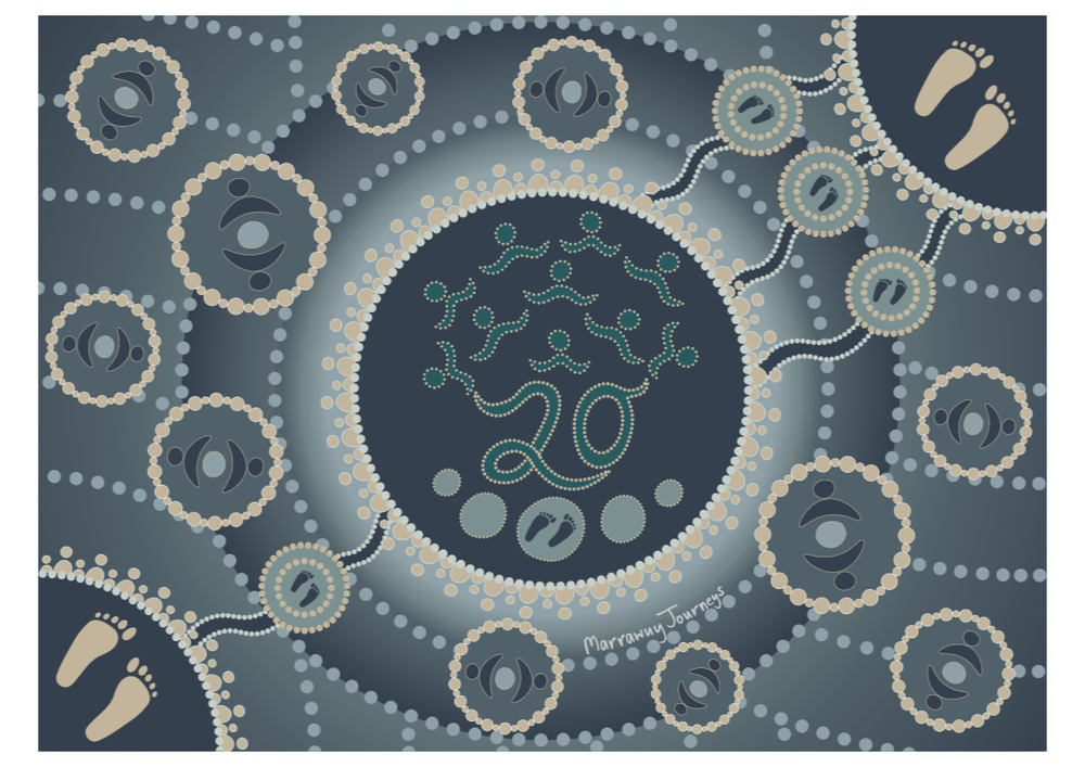
MEDITECH: Paths of Progress (November 2024)
“Paths of Progress” celebrates 20 years of MEDITECH in Australia, capturing the essence of its growth, resilience, and forward momentum. Anchored in the present, it honours the legacy that MEDITECH has built while looking with optimism toward future pathways and possibilities.
In the bottom left, footprints symbolise the foundational steps that have led to the present, each marking a pivotal moment in MEDITECH's story. These footprints, symbolising the past, underscore the essential groundwork that supports today’s achievements and strengths.
At the top right, the artwork opens into the future. Three distinct sets of footprints emerge, representing the diversity of paths that will shape MEDITECH’s ongoing journey. This forward movement signifies the dynamic, evolving future of MEDITECH, rich with potential and driven by innovation.
The present day forms the heart of the piece, with the number '20' as the trunk of an abstract tree. The roots and lower branches symbolise the strength and legacy of MEDITECH’s history, deeply embedded in its mission and core values. The central footprints on stepping stones create a bridge between past and present, carrying forward MEDITECH's core values and forging a solid path for the future.
From the trunk, the tree branches into leaves and upper boughs, formed from symbols of people - representing MEDITECH's staff, clients, partners, and shareholders - all of whom nurture and shape its continued growth.
Radiating outward, ripples symbolise MEDITECH's expanding impact, echoing the strength of its network and the reach of its partnerships, both domestic and international. Scattered elements on these ripples depict the countless connections MEDITECH has fostered, celebrating its growing legacy in Australia and beyond.
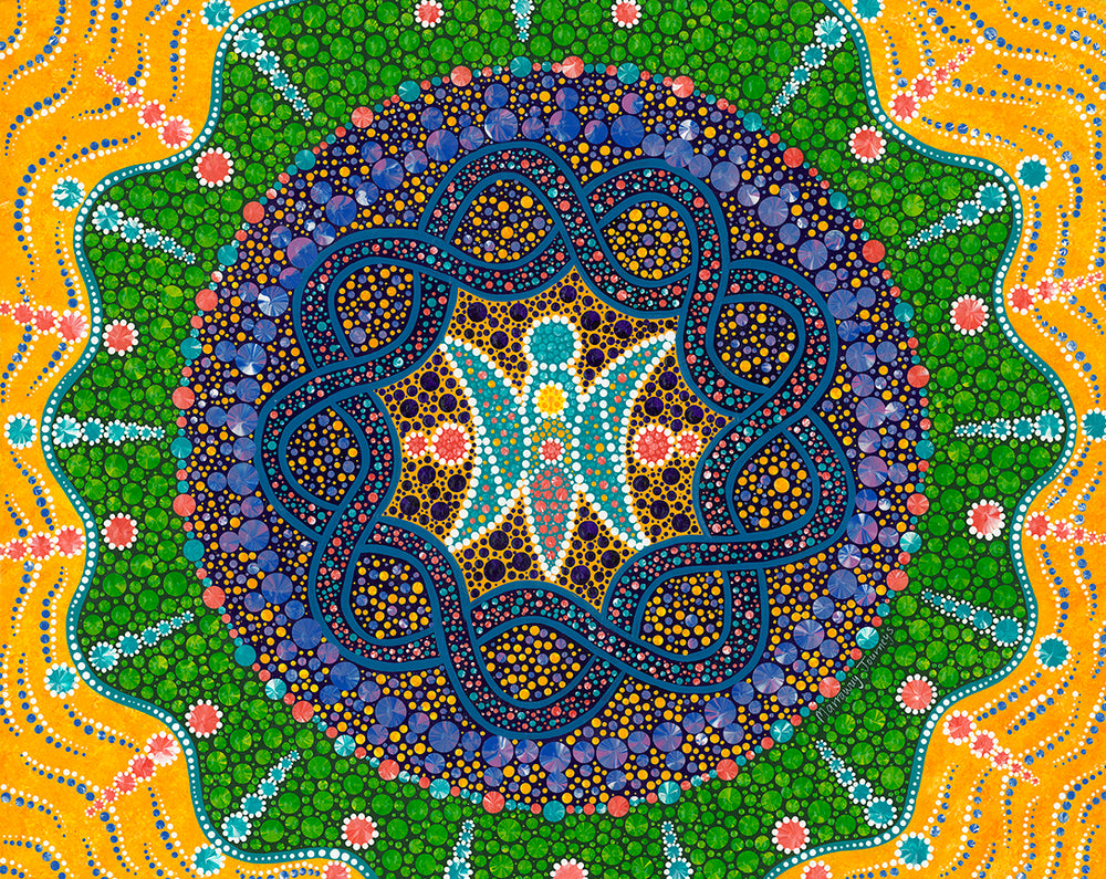
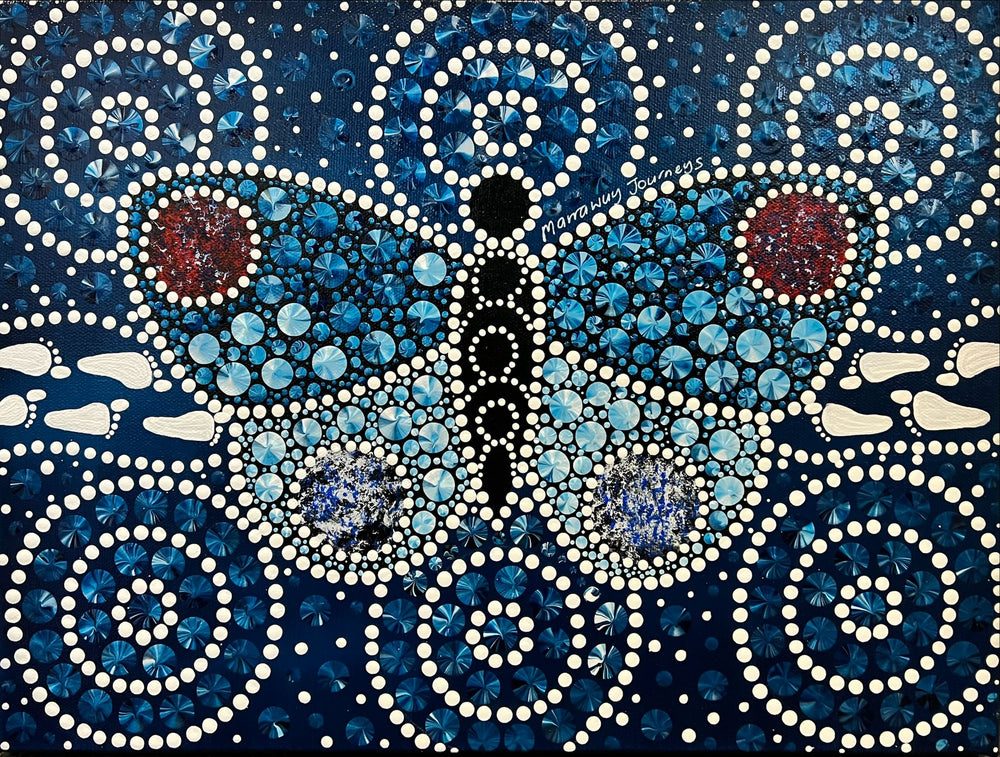
ADACAS: Wings of Advocacy (24x30 inches) August 2024
“Wings of Advocacy” serves as a representation of the values and purpose of ADACAS, conveyed through the interplay of colours and abstract symbolism. At its heart lies an abstract butterfly, embodying ADACAS itself. The butterfly's body represents the dedicated staff who are the backbone of the organisation, while its wings symbolise the care, compassion, and unwavering support they offer to their clients.
The two interlocking lines within the butterfly represent the deep commitment ADACAS has to its purpose and to the individuals it serves. These lines, surrounded by icons symbolising people, create a visual narrative of connection and advocacy, underscoring the organisation's dedication to upholding the rights and dignity of its clients.
The outer layer of the artwork signifies ADACAS' extensive reach, providing support from Canberra to the South Coast. The colours capture the diversity and inclusivity of the communities ADACAS serves, while also drawing inspiration from the landscapes that connect these regions. This layer not only highlights the geographical breadth of ADACAS’ impact but also symbolises the growth, healing, and support the organisation fosters in these communities.
ACT Education Directorate: Commitment to Impact (24x30 inches) May 2024
“Commitment to Impact” was created for the ACT Education Directorate's (Directorate) Aboriginal and Torres Strait Islander Employment Action Plan (Action Plan). It visually represents the Action plan aimed at building capacity to integrate Cultural Integrity, foster inclusiveness, and celebrate diversity, including Aboriginal and Torres Strait Islander cultural ways of learning, being, and doing. By living these values, the Action Plan empowers all employees to apply their skills, ideas, perspectives, and qualities, ensuring everyone can flourish. At the core of the design are three ripples ascending from the bottom to the top, each ripple representing a vital focus area and distinguished by unique colours, each carrying its own significance.
The first ripple, Attraction & Recruitment, is depicted in red with footprints symbolising a journey. Red represents action and enthusiasm, highlighting the dynamic efforts to create opportunities for Aboriginal and Torres Strait Islander people to join the Directorate.
The second ripple, Retention & Capability Development, is represented in green by hands and two connecting dots. Green symbolises growth and commitment, reflecting the focus on nurturing and developing staff capabilities. This imagery highlights the commitment to retaining talent and fostering continuous professional development.
The third ripple, Leadership & Accountability, is symbolised in purple by a circle surrounded by arcs. Purple represents passion and leadership, signifying the positive impact of good leadership and accountability on workforce culture. This element emphasises the importance of leadership at all levels within the organisation.
The interlocking blue lines running parallel to these ripples, represent the Directorate’s commitment to the Action Plan, its staff, and the goal of delivering welcoming, supportive, and aspirational public schools. Blue signifies commitment and growth, highlighting interconnectedness and a unified approach to the Action Plan’s objectives.
In the top left corner, the four school networks across the ACT and in the bottom right corner, the four educational sectors, are represented against a yellow background with green elements. Yellow represents optimism and a welcoming feeling, while green symbolises growth, highlighting the tailored and energetic approach to different areas and the focus on growth across all educational levels.
This artwork serves as a visual roadmap, illustrating the interconnected elements of the Action Plan and commitment to support all employees to realise their full potential within an inclusive and equitable workplace.
Act Education Directorate: From Foundations to Future (24x30 inches) May 2024
“From Foundations to Future '' was created for the ACT Education Directorate's (Directorate) Gender Equity Employment Action Plan (Action Plan). The artwork visually narrates a powerful journey toward achieving gender equity and equality, structured through a series of layers, each imbued with symbolic colours and meanings.
Starting from the bottom, the first layer represents the bedrock of collective responsibility, encompassing the roles of individuals, families, educational institutions, workplaces, and broader societal institutions. The colours used here - purples, aqua, and yellow - signify leadership, responsibility, and optimism, reflecting the foundational commitment needed to drive change. This layer underscores the essential role of every societal segment in fostering a culture that prioritises gender equity.
The second layer from the bottom is rendered in shades of blue, symbolising the steadfast commitment required to uphold gender equity. This commitment manifests in policies, practices, and everyday actions that ensure equal opportunities for all, regardless of gender.
The middle layer, painted in gender-neutral hues such as orange, green, and yellow, represents the principle of equal opportunities. This section highlights the universal aspiration for fairness and the dismantling of barriers that traditionally hinder gender parity. It stands as a bridge between commitment and the actionable priorities necessary to achieve gender equity.
The second layer from the top features a palette of greens, yellows, and browns, with brown as the dominant colour, symbolising progress, optimism, and stability. This layer represents the strategic priorities and steps required to move towards gender equity. These steps might be undertaken concurrently but could also be achieved at different times, reflecting the non-linear and multifaceted nature of societal change. The dots that punctuate each layer symbolise the ongoing journey, acknowledging both the milestones achieved and the challenges yet to be overcome.
The top layer, inspired by the colours of a sunrise - yellow, orange, red, pink, purple, and dark blue - captures the vision of a society where gender equity and equality have been realised. These colours represent new beginnings and the dawn of an inclusive era with the person icon using colours from the previous layers to signify the culmination of efforts and the harmonious integration of various societal contributions toward this ultimate goal. The depiction of individuals in this layer using yellow represents optimism for this future. The sunrise palette encapsulates the hope and promise of a future where equity and equality are the norm, not the exception.
"From Foundations to Future," beautifully illustrates the collective journey and unwavering commitment required to build a society rooted in gender equity.
Australian Airports Association: Connecting Horizons(30x40 inches) May 2024
“Connecting Horizons” was commissioned by the Australian Airports Association (AAA), serving as the national voice and primary advocate for airport-related policies nationwide. With a focus on the theme of connection, the artwork embodies AAA's commitment to fostering meaningful connections with its members, who in turn facilitate journeys for countless individuals.
At the heart of the artwork, AAA is portrayed at the centre by blue skies, white clouds, and the radiant sun. Three ripples extend outward, connecting with the sun rays that encircle AAA to symbolise AAA's role as the national voice representing a diverse range of members including airports, aerodromes, and corporate organisations. As well as the leading advocate for appropriate national policy relating to airport activities informed by its members.
AAA’s 340+ members are represented by the blue dots around the sun rays and paths that extend around the artwork. Together, they actively engage in addressing industry challenges and seizing opportunities contributing to an air transport system that is safe, secure, competitive, and environmentally sustainable for the benefit of all Australians and visitors. This is depicted in the artwork by the people icons between the blue paths who are being connected on their journeys.
Inspired by the vibrant colours of the sky and land from high-altitude flights, the background completes the piece, creating a dynamic representation of AAA's commitment to connectivity and progress in the industry.
AusIMM: Journey of Influence (30x40 inches) April 2024
“Journey of Influence” is inspired by the central theme of connectedness as AusIMM progresses in their reconciliation journey. Transitioning from raising awareness to embedding and expanding their sphere of influence, the focus shifts from internal reflection to actively engaging AusIMM's communities of interest (COIs) and including them in the journey.
At the heart of the artwork lies the central element symbolising AusIMM, as the peak body for people working in the resources sector, and its broad groups of Communities of Interest (COIs) consisting of Branches, Societies, Chapters, Networks, Committees, and International communities coming together to collaboratively pursue shared reconciliation goals.
The five circles, intersecting the central element, represent the five dimensions essential for fostering genuine reconciliation. Positioned in a clockwise manner, they symbolise unity, institutional integrity, equality and equity, race relations, and historical acceptance.
The six footprints, surrounded with icons that represent the people of the COIs, extend outward from the central element to signify the active engagement and connection with AusIMM's reconciliation journey.
Overall, “Journey of Influence” serves as a visual reminder of AusIMM's commitment to reconciliation, portraying the journey from awareness to embedding and expanding their sphere of influence. It celebrates the interconnectedness of all involved in this ongoing journey towards reconciliation.
Queanbeyan District Preschool Association Hands to Nurture, Steps to Progress(16x20 inches) March 2024
“Hands to Nurture, Steps to Progress” is a piece that I created for Queanbeyan District Preschool Association that represents their connection with community, families, educators, and children in a shared journey towards reconciliation.
The handprints signify a "wraparound approach" to nurturing and developing children. This approach encompasses all aspects of a child's growth and well-being using a play-based approach to learning. The ripple effect dispersing outwards from the handprints represents the impact and influence of this approach, spreading positivity and growth to the wider community.
The stepping stones symbolise progress and advancement along the reconciliation journey. Each stone represents one of the nine action areas across reconciliation across three areas - building relationships, respect, and opportunities in the classroom, around the school and within the community.
Lastly, the dots surrounding each stepping stone and along the river represent the children, educators, parents, and the broader community - coming together to progress the reconciliation journey.
Queanbeyan District Preschool Association logo March 2024
Explanation of logo elements:
The river running through the centre is the Queanbeyan river with the circle (head), the two footprints and the hands representing the child and QDPA’s commitment to their growth and development but also the five values of Children, Family, Inclusion, Community and Service excellence.
The four footprints represent the four preschools and the paths beside are the children journeying to the preschools where they learn and grow (the two inner circles).
Lastly, families and communities are depicted by the people icons around the outside.
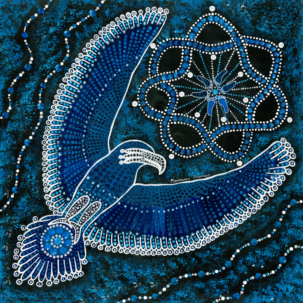
Gungahlin Jets: Wings of Unity (24x24") February 2024
This artwork, titled "Wings of Unity," serves as a powerful representation of the collective spirit and solidarity within the Gungahlin Jets club. Inspired by Robbie's vision, an eagle is the central feature of the design to symbolise the club's united journey. The eagle, with its intricate details in the wings, body, and tail, becomes a metaphor for the interconnectedness of the club, players, supporters, and the larger community, all uniting as one club and one family.
The wavy lines in the background of the artwork are purposefully incorporated to convey a sense of movement. This movement represents the dynamic and ever-evolving nature of the club, highlighting the constant progress, growth, and momentum in its journey.
Additionally, the three distinct footprints featured in the artwork hold significant symbolism. Each footprint represents a vital component of the club – the senior football, junior football, and netball teams. These footprints are not isolated but rather surrounded by an interconnected element, symbolising the loyalty and commitment shared by the club, its players, and supporters. The idea is to emphasise that everyone involved is part of something bigger than themselves, contributing to the shared success and legacy of the club.
"Wings of Unity" captures the essence of a united sports community, where diverse elements come together to soar to greater heights. It illustrates the harmony between the players, supporters, and the broader community, showcasing the strength that lies in unity and common purpose within the club.
National Convention Centre: Ripples of Inclusivity(24x30 inches) January 2024
“Ripples of Inclusivity” created for the National Convention Centre (NCC), serves as a visual representation of the overarching themes of connection, collaboration, and unity. It not only reflects the business journey of the NCC but also captures the diverse journeys of individuals who visit, connect, and collaborate within the space of the National Convention Centre.
At the core of the painting is the representation of NCC creating a connected and inclusive environment for both its staff and clients to thrive. The use of three layers - footprints, a wavy yellow line of small and larger dots resembling people holding hands, and scattered yellow and green dots - symbolizes the diverse range of clients and the varying lengths of journeys they undertake.
To convey NCC's business journey, the painting draws inspiration from Lake Burley Griffin, featuring a flowing body of water extending from the bottom left to the top right. Within this water body, ripples symbolise how the contribution of one person can have a far-reaching impact. Specifically, 10 ripples represent IHG's Journey of Tomorrow's five focus areas and NCC's five values.
In a nod to the strong connection to Canberra, the background of the painting is inspired by the wondrous colours of the different seasons of the region. This inclusion further anchors the artwork to the local context, creating a holistic representation of the NCC's commitment to connection, collaboration, and inclusivity.
Thylacine: Pathways of Connection (24x30") December 2023
“Pathways of Connection” was inspired by the immersive experiences Thylacine creates using various mediums to connect people, place, and stories in a way that is accessible, fun, and engaging.
The piece depicts intertwining paths around five elements that represent the common mediums Thylacine uses to create an immersive experience including 2D and 3D elements, responsive design, sound, and light.
Weaving around the elements, the footprints represent the stories being told within these immersive experiences with the other path representing people being connected to the stories and experiences.
Lastly, the background will represent a place with various landscapes depicted using colour and texture. From the oceans, through the forests, mountains, and bush, alongside the rivers to the red dirt of dry areas.
Parbery Consulting: Ripples of Authenticity (48x60") December 2023
“Ripples of Authenticity” was inspired by Parbery’s strong commitment to a people-first approach to business that supports people’s growth in a safe, non-judgmental environment.
At the centre of the artwork Parbery’s commitment to people first is depicted with people abstractly connected forming a journey. This is to signify that people are key to Parbery’s journey. The next layer is using two interlocking lines to represent ongoing commitment to people, values, and purpose. Taking inspiration from one of the participants comments, the next layer is inspired by mountains to represent a solid foundation and represents Parbery’s
strong principles of honesty and fairness. It also represents alignment of community and commercial goals for the greater good with abstract people representing community and clients.
Extending off the centre element, is the ripple effect representing Parbery’s belief that opportunities are created by working as a team leading to growth in a holistic sense. Therefore, interconnecting with the ripples, are opportunities gravitating towards Parbery.
The colours used throughout the piece represent Parbery’s commitment and values of creating a caring, nurturing environment that people can grow, develop, and feel safe to be authentic.
Hawker Primary School: Footprints of Time (24x30") November 2023
“Footprints of Time” was specifically designed for Hawker Primary School, taking inspiration from its core theme of being a school driven by its community and having a strong connection with parents, students, and staff both past and present.
The lower portion of the artwork, which features three footprints, symbolises the students, teachers, and community. The outdoor learning area, which fosters a sense of togetherness and growth, was another source of inspiration. The ornamental pear trees and stones depicted in varying shades represent the changing colors of the trees throughout the year. The interlocking lines convey an ongoing commitment, while the people icons signify everyone who is and remains connected to the school. Lastly, the top half of the piece represents the four houses of the school - galaxy (blue), pulsar (green), quasar (yellow), and nova (red).
Ultimately, “Footprints of Time” serves as a reminder of the positive impact and strength of a community-driven approach that emphasizes building an enduring connection between all those involved with the school.
HPG Solutions: Ripples of Opportunity (24x30") November 2023
"Ripples of Opportunity" is centred around key themes of personal growth, community, and the far-reaching effects of individual decisions. At its heart, the footprints represent Lee's journey, and the choices he has made along the way that create a platform for positive opportunities for generations to come. The ripples either side of Lee’s Journey represent HPG being a people-focused business and the positive impact providing support and communication can have in igniting a chain reaction and fostering a nurturing environment.
The outer bottom ripple symbolises Lee's connection to his country, the Blue Mountains, and the outer top ripple, serves as a reminder of the power we hold in shaping our own journeys through the choices we make. Prompting reflection on the potential for positive change that resides within us all. Together, these elements invite viewers to contemplate the transformative impact of personal agency, community support, and a nurturing environment.
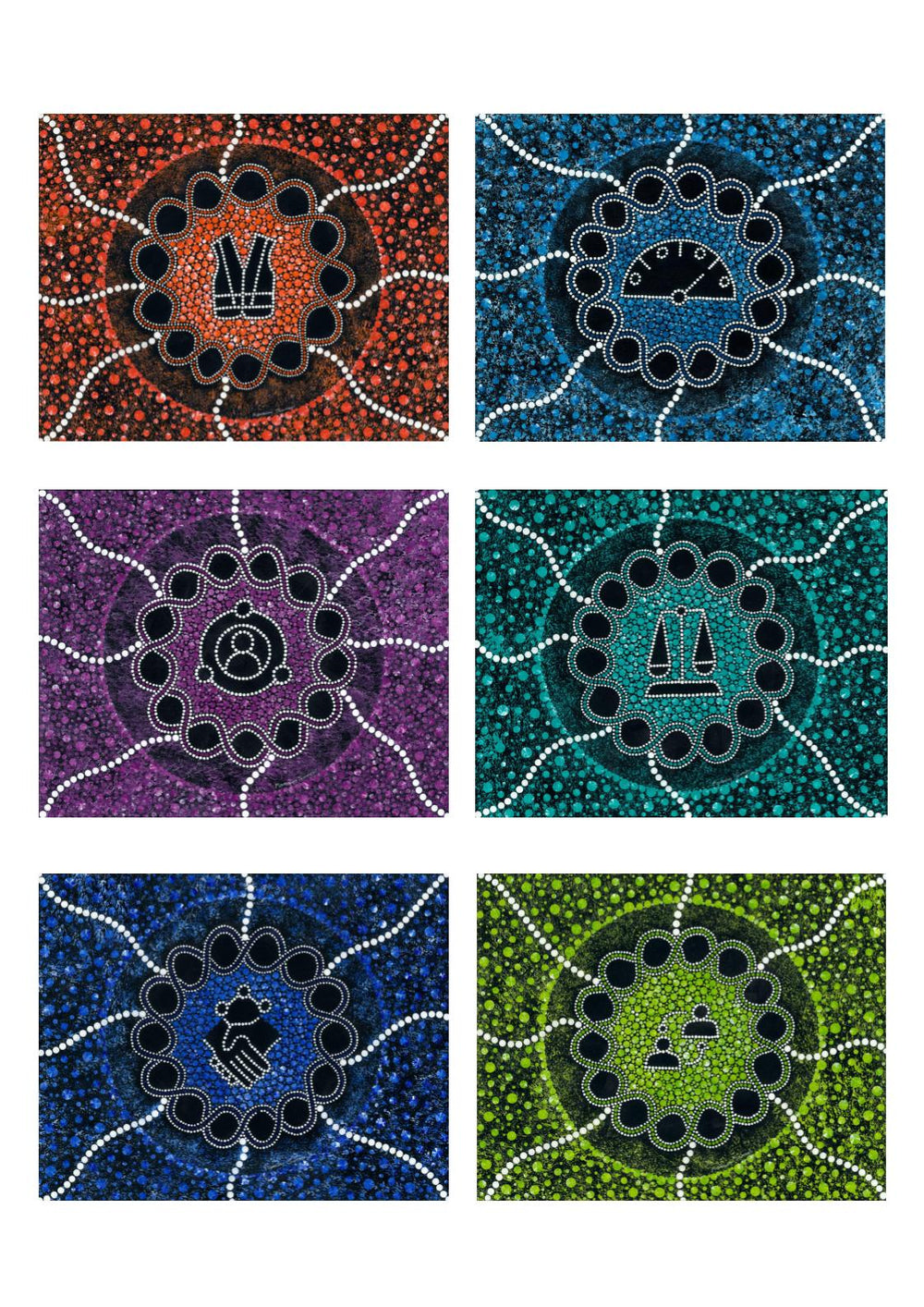
Tailored HR Solutions: Collaboratively Uplifting (24x30") November 2023
The artwork titled "Collaboratively Uplifting" draws inspiration from Tailored HR Solutions (THRS) and their commitment to a collaborative approach towards uplifting their clients' capabilities. Their focus on facilitating enhanced organisational performance and sustainable outcomes is at the core of the piece, with THRS' logo serving as a foundational element of the artwork.
Surrounding the foundational element, six values are represented by different symbols, each representing a distinct aspect of THRS' work philosophy. These values include Innovation and Creativity (yellow), Collaborative and Agile (green), Act with Integrity (grey), Supportive and Caring (blue), Building Expertise through Continuous Learning (red), and Transparent and Effective Communication (orange).
The next layer of the artwork features two interlocking lines with dots on either side, symbolising the THRS team's dedication to fulfilling their purpose for their clients. Finally, the artwork features ripples, representing the positive impact of sharing knowledge and uplifting capabilities with a warm and empathetic approach to client work.
Rabobank: Cultivating Connections (24x30") October 2023
“Cultivating Connections” was a piece created to represent Rabobank whose purpose, as a global cooperative bank, is to ‘help our clients feed the world more sustainably’. The piece was inspired by key themes such as ‘growing a better world together’, ‘people-first approach’ and ‘knowledge sharing and networking’ .
With the theme of growing at the heart of the piece, it features trees’ growth rings and interconnecting roots. The concept resonated with me because trees share water and nutrients through the networks, and also use them to communicate. They send distress signals about drought and disease, for example, or insect attacks, and other trees alter their behaviour when they receive these messages to strengthen their foundations. I likened this to the work Rabobank does, facilitating the knowledge sharing and networking for a strong industry.
At the heart of the piece, is an element that represents Rabobank and is inspired by the sundial in Rabobanks logo. With people and a heart representing Rabobank is the bank with food at its heart. The four corner elements represent Rabobank’s global growth and sustainability, clients, community and relationships.
It is hoped that when Cultivating Connections is viewed, that people feel a connection to the Rabobank story and its journey of helping their clients feed the world more sustainably.
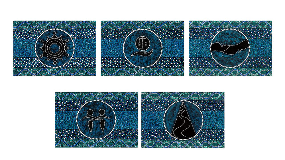
Marymead CatholicCare Canberra & Goulburn Values (Set of 5 24x36 inches) August 2023
This set was commissioned by Marymead CatholicCare Canberra and Goulburn (MCCG) to represent their five values; Care & Compassion, Inclusivity, Excellence, Integrity and Respect with each design explained below.
“We will act with Care & Compassion in all that we do.” The Care & Compassion piece is represented by two people with interlocked arms.
“We value diversity and actively foster Inclusivity and meaningful participation within community.” The Inclusivity value is represented by three ripples surrounded by people who have been abstractly and diversely represented.
“We have Respect for all people, recognising every person has inherent dignity and worth.” The Respect value piece is an abstract representation of two people taking hold of each other’s forearms as if one was helping the other up.
“We strive for Excellence and aspire to the highest standards of service.” The Excellence value piece is represented by an abstract ‘E’ in the form of a path to the tip of a mountain.
“We will act at all times with Integrity.” The Integrity value has been represented using a hand holding a set of balanced scales.
Seizing Opportunities (30x40"), May 2023
The artwork titled "Seizing Opportunities" is inspired by my “Moments” artwork based on the William Arthur Ward's quote, "Opportunities are like sunrises. If you wait too long, you miss them." The artwork celebrates the value of independent education and the role that Independent Schools Australia (ISA) plays in ensuring that young people have access to a diverse range of educational opportunities.
ISA is the peak body that represents the national interests of the independent schools sector. Through collaboration with its eight member associations, ISA promotes choice, diversity, and partnership in education, while advocating for ongoing and sustainable Australian Government support and fair funding. The artwork depicts ISA at the bottom, connecting with its member associations, and the four semi-circles of the sun represent its objectives of collaboration, advocacy, representation, and information.
The vibrant colors of the artwork represent the energy and creativity of the independent schools sector, while the semi-circles of the sun symbolize ISA's commitment to working collaboratively to seize opportunities and build a brighter future for independent education in Australia. Through its work, ISA is helping young people seize the opportunities that come their way, just as the sun rises each day to offer new possibilities.
Choosing a Journey of Hope (30x40"), May 2023
"Choosing a Journey of Hope" is an artwork created for the Chris O'Brien Lifehouse (Lifehouse) that is inspired by their purpose and core values.
At the centre of the artwork, a hand with the star of hope represents the Lifehouse's patient-centred care and empowerment. It signifies their commitment to improving the quality of life for those affected by cancer. Moving outward, two hands embracing a heart symbolise the nurturing and compassionate support provided by the Lifehouse, reflecting their core value of nurture.
In the top-right corner, the artwork displays the power of collaboration and partnership. The connection of six dots represents key stakeholders in the cancer treatment journey, including patients, caregivers, healthcare professionals, researchers, volunteers, and the community. The interlinking dots symbolize the collective effort and shared responsibility in advancing cancer care and support.
Towards the bottom-left corner, a lifeline with the growth of new trees represents the Lifehouse's commitment to quality of life and respect. It acknowledges the importance of dignity and embracing diversity in providing comprehensive care. The element of footprints represents the journey of hope that patients and their loved ones embark upon, embodying their strength and determination.
In the background, elements symbolising opportunities for research and discovery highlight the Lifehouse's dedication to inspiring hope and transforming cancer.
Building Connection (40x40"), April 2023
Early conversations with the Manteena team highlighted key themes of a family-based culture, connection, diversity of clients and their own organisational reconciliation journey. All these themes were the inspiration for the ‘Building connection’ artwork and its elements.
The three layers in the background are inspired by the colours of the different landscapes which Manteena delivers its projects across. From the green of the Canberra region, where Manteena’s headquarters are based, to across Australia and seas. The smaller circles that connect to the green centre, but expand across the layers, represent the wide reach of Manteena’s clients and projects.
The three symbols in the centre represent the three key areas of a Reconciliation Action Plan - respect, relationships, and opportunities. They are connected to the Canberra headquarters to represent the positive impact of embedding RAP initiatives internally but also across into the next layer to represent the positive external impact.
Lastly, the figures around the edge represent Manteena’s family-based culture including their families, their clients, and the community all of whom contribute to Manteena’s purpose of leading the way in quality construction.
Journeys of Opportunity (30x60"), February 2023
Bupa Medical Visa Services (BMVS) provides immigration health assessments and medical services for customers who temporarily visit and those that migrate to Australia. BMVS in Canberra commenced in July 2022 in a new-purpose built centre that provided the rare opportunity for the staff who all started at the same time, to learn and grow together in a safe place where differences are celebrated.
“Journeys of Opportunity” was commissioned to celebrate the centre’s commitment to its purpose and represents the customer's journey through BMVS. The sunrise colours in the background represent the theme of new beginnings and the blue overlay represents opportunities. At the centre of “Journeys of Opportunity” is the interpretation of BMVS’ passion for welcoming customers from all different backgrounds to Australia and staff’s commitment of delivering their organisational purpose of helping people live longer, healthier, happier lives and making a better world. Interconnecting with BMVS’ commitment, are footprints that represent the customer's journeys through BMVS whether that be a temporary visit to Australia or a journey of migration to Australia whilst being made to feel welcome on their journey.
Reach for the Stars (and Beyond)(24x30"), February 2023
“Reach for the stars (and beyond)” takes inspiration from my Boundless piece which was inspired by Matshona Dhliwayo’s quote “Reach for the stars, not your fears”. I have always challenged myself but it has only been the last couple few years or so that I have stopped being limited by fear. Trusting in myself and my abilities and being ok with uncertainty is helping me to become boundless in whatever endeavours I choose to undertake in my own journey. I hope that the students who participate in the Australian Science Innovations’ (ASI) programs can draw strength from this piece and stretch themselves to reach their highest potential.
The key elements of this piece are the students from the four science disciplines as well as the junior science stream (green figure). The two sets of footprints represent the students’ journey of coming together with other like-minded students at the ASI programs who share the same passion for science. Even though they compete against each other at the Australian Science Olympiads, they support each other and form lifelong relationships that continue long after their ASI journey ends.
The circles and paths that connect to the centre are inspired by the eight planets in the solar system and represent the opportunities to unleash their boundless curiosity for the science disciplines.
Healing Hands (40x40"), January 2023
“Healing Hands” was specially created for Bungendore Chiropractic, The Family Practice. It represents the unlimited benefits clients can experience from continuous Chiropractic Care. I also drew inspiration from my own personal experience receiving Chiropractic Care during and post pregnancy, which I believe contributed to the positive birthing experience with my daughter, Aurora in late 2022.
At the centre of this piece, you will see two hands, representing Dr Nat, delivering various and customised health benefits to each and every one of her clients, represented by the trees. Just like the roots of a tree deliver nutrients and structure for a tree to grow, the care Dr Nat provides, gives a solid foundation needed for her clients to reach their highest greatest wellness potential – which is then represented by the blossoming branches of the trees.
The pink ripples in the background represent the various and ongoing health benefits received from continuous Chiropractic Care, which grows and continues the more consistent one is with receiving Chiropractic Care.
Inclusive Connections (36x60"), October 2022
Capital Region Community Services (CRCS) has a vision of an inclusive, connected community and Inclusive Connections represents their commitment to their vision.
Starting at the left of the artwork, is a circular element that represents CRCS surrounded by their staff, followed by two interlocking lines that represent their commitment to the individuals, families, children, and young people (different coloured people around the outside) that they provide a wide range of programs and services to (different coloured individual dots). It also represents their commitment to the reconciliation journey and working towards their vision for reconciliation.
CRCS currently provides their services in seven locations across the capital region and the paths that journey out from the circular element represent this diverse reach. The opportunities and the positive impact that CRCS provides for the communities they service is subtly captured by the ripple rings that can be seen in the background of the piece.
The key themes of Inclusive Connections are connection, journey and diversity and it is hoped that all who view the piece can feel that inclusion and connection to the CRCS journey.
Uplifting Journeys (24x30"), October 2022
‘Uplifting Journeys’ represents Visa’s Reflect RAP journey, the people who are supporting this journey and the Visa employees and clients that will be a part of the journey to bring Visa’s Reconciliation Action Plan (RAP) vision to life. The piece also represents Visa’s wider purpose to uplift everyone, everywhere by being the best way to pay and be paid.
To represent these journeys, the bottom of the artwork represents Visa beginning their reconciliation journey surrounded by a row of people that represents the organisational culture of ‘One Visa’. This section then connects with the key areas of a RAP - respect, opportunities, relationships, and internal governance. Linking these four key areas and Visa, the footprints at the top represent a future state in Visa’s Reflect RAP journey where RAP commitments have or are in the process of being achieved.
Lastly, surrounding the RAP journey is the representation of the interconnectedness and diversity amongst Visa's people, technology, customers, and geographical locations.
It is my hope that “Uplifting Journeys” creates a feeling of pride and that Visa’s stakeholders feel connected to the journeys of Visa and reconciliation.
Growing Connection (36x48"), October 2022
The key themes of “Growing Connection” are growth and connection. Growth in terms of future aspirations of continued expansion but also growth as an organisation gained from embarking on the reconciliation journey; and connection in terms of connection with First Nation people but also TTW employees and clients.
Taking inspiration from the shape in the Our History video of the ‘walk through aviary of Taronga Zoo,’ the infinity shape of footprints represents various stakeholders’ ongoing journeys with TTW - be that a client, an employee, or community. The incoming footprints from the corners represent TTW’s new stakeholders that become part of the ongoing journey.
The orange dots that form ripples through the piece, represent the ripple effect of change, that is, TTW’s growth over the years, as well as future growth, and the positive impact that TTW’s reconciliation journey will have, both internally and externally. Lastly, the colours inside each ripple represent my interpretation of the various localities - blue for Sydney, eucalyptus green for Canberra, tropical green for Jakarta, grass green for Melbourne, yellow for Brisbane and orange to represent the future TTW locations.
It is my hope that “Growing Connection” creates feelings of welcome and belonging for all TTW stakeholders.
Diverse Alignment (24x30"), October 2022
“Diverse Alignment” was created for the Australian Medical Council’s (AMC) Aboriginal, Torres Strait Islander and Māori Strategy. The purpose of the strategy is to build on AMC’s commitment to ensure that standards of education, training and assessment of the medical profession protect and promote the health of the Australian community including Aboriginal, Torres Strait Islander and Māori Peoples.
A key element of “Diverse Alignment” is to recognise the important part Aboriginal, Torres Strait Islander and Māori Peoples’ knowledge plays in achieving positive outcomes for our people and combining this with the role AMC plays in delivering initiatives to support Closing the Gap in terms of health outcomes. The combining of all these valuable knowledge sources is represented by the four paths coming together in the centre.
In addition, it was important to represent the healing elements of nature that served, prior to colonisation, and still serves Aboriginal, Torres Strait Islander and Māori Peoples. So, surrounding the four paths, which also represents the healing element of the sun, I have included some natural healing elements that resonate with me - water, trees, earth, and fire/smoke.
It is my hope that “Diverse Alignment” generates a feeling of meaningful connection where relationships are strengthened, and diversity of knowledge is respected.
A Journey Through Time (30x60"), September 2022
‘A Journey Through Time’ depicts Toll’s journey over the past century. Beginning at the base of the artwork, Albert Toll establishes his horse and cart coal service in 1888.
From there, Albert continued to expand over the next few decades including purchasing the transport company and becoming a national service in the 90s.
Moving into the third quadrant, the artwork captures the 2000s where critical mass was gained and new partnerships established including the continued expansion overseas.
Bringing it all together to create a united Toll, the last segment at the top of the artwork represents Toll being united and continuing its growth journey into the future.
Running parallel to the middle segments and leading to the future represents the change from a horse and cart (at the base of the artwork) to road, air and sea. Lastly, supporting this journey and represented by the varying sized white dots, are Toll’s people.
The Toll Values (6 x 24x30 inches) September 2022
‘The Toll Values’ set depicts six values of Toll - Safety, Customer, Teamwork, Progress, Integrity, and Accountability. Each value has interlocking lines around the outside to represent commitment to that value and the outer circle ripple represents the positive impact these values have on Toll’s culture. The intersecting patterns throughout the set represents Toll’s people who play a significant role in bringing these values to life every day in their roles.
Diverse Connectedness (set of three, 30x88"), August 2022
‘Diverse Connectedness’ is a piece that represents coming together, virtually or in person, of Digital Transformation Agency’s (DTA) diverse internal and external stakeholders and creating an environment that values diversity and where all feel welcome and connected.
It is inspired by a rising sun to illustrate the process of rising towards a digital future and connecting DTA’s internal stakeholders (the pink figures) with the external stakeholders (the yellow figures), who are connected regardless of remoteness, and who are sharing knowledge and working together to secure Australia’s digital future.
The ripples that transcend across the three pieces represent the positive impact this will have for all Australians and communities who are represented by the circles within the ripples.
Here for You (set of 3, 16x20"), May 2022
Across the three panels is the lifecycle of a butterfly, beginning as a caterpillar and transitioning to a butterfly.
In the first panel, there are two caterpillars that represent the carer and the person being cared for. The yellow theme represents positivity, and perhaps happier times. The symbols in the leaves represent diagnosis, acceptance of diagnosis and getting prepared for the journey ahead with a focus on utilising CarerHelp resources and creating a support network.
The magenta panel, panel two, represents compassion. It is the stage where the carer is caring for the dying person and supporting them with their needs including getting their affairs in order. It also includes a focus on self-care of the carer and following through with their own self care plan. At the edge of the second panel, the person being cared for dies and this is represented by the cocoon, the other caterpillar, the carer, continues on its own journey.
The green/blue theme chosen for the third panel represents grief and growth.The carer is grieving and adjusting to life after caring, but also experiencing personal growth. The one they cared for is still with them, just in another form - a butterfly.
You’re Not Alone (24x30"), April 2022
You’re Not Alone represents a parent's journey in adjusting to the life a new baby brings and the support and care the Perinatal Wellbeing Centre (the Centre) provides. With key themes of nurturing, supporting, journey and the ups and downs of early parenthood, the piece follows a parent’s journey through the Centre.
The journey begins at the bottom left corner of the artwork, where a parent becomes aware of the services provided by the Centre and connects with a mental health worker.
The centre of the artwork represents the parent joining other parents at the Centre for support. Support includes 1-1 sessions with a perinatal mental health worker and the option to attend group sessions. These group sessions provide the parents an opportunity to meet and connect with other parents on similar journeys and expand their support network.
The top-right corner represents parents transitioning out of the Centre equipped with knowledge, tools, and networks to support their parental journey with the understanding that the Centre is there to assist them should they need to reach out for help in the future.
The background fades from dark to light to represent the parent’s journey but also represent the Centre’s visibility once parents know the support is available. The ripples represent the ripple effect of how a slight change (reaching out to the Centre for support) can have a significant impact (positive impact for the journey of parenthood).
Healing Together (24x30"), September 2021
ACT’s (BBACT) journey of healing and reconciliation as a community.
The journey begins by laying some solid foundations.This is represented at the bottom of the piece by the earthy colours and signifies Ngunnawal country. Ngunnawal country is the land on which BBACT and the clubs (represented by the six paths) come together to play the game they share a passion for and ignite the healing journey.
BBACT and the clubs shared commitment to this ongoing journey of healing and reconciliation is represented by the paths crossing and coming together (the two interlocking lines) which ultimately lead to a future state where all players and supporters come together and feel welcomed and included. This also extends to the wider ACT community represented by the (blue/yellow ripples).
Commitment to Connection (40x40"), July 2021
‘Commitment to connection’ tells the story of IPAA ACT and their commitment to Canberra and community, including their ongoing journey of reflection, respect and reconciliation.
The overall concept reflects connection with the private, public, peak bodies and academic sectors and relationships with the other state and territory IPAAs coming together to share expertise and knowledge. Debating, collaborating, innovating, communicating and building capability in public administration. In particular it shows IPAA ACT as a conduit to connect.The colours and elements of ‘Commitment to connection’ are inspired by those seen in the Canberra region.
The leaves of a eucalyptus, the most common native tree in the region but also common in other regions of Australia, represents IPAA ACT and the other sectors coming together in an abstract royal bluebell shape to represent Canberra. The colours of the leaves were inspired by the colours I see during autumn in the region. Since moving to the region nearly a decade ago, I am still mesmerized by the beautiful colours seen in the distinct seasons experienced in the region, autumn included. The royal bluebell’s yellow centre represents IPAA ACT and the sectors coming together, the royal bluebell petals represent each of the sectors and the outside of the royal bluebell represents the ACT community. Surrounded on the outside by IPAA QLD, NSW, VIC, TAS, NT, WA, SA to represent their connection to IPAA ACT but also connection to the Australian community.
Sunrise to Sunset (20x40"), May 2021
‘Sunrise to Sunset’ was created to reflect CHN’s cultural journey to date and their Cultural Competency Framework (CCF).
The concept as a whole is an abstract representation of a First Nation individual surrounded by community and how the journey CHN is on, will positively contribute to the social and emotional wellbeing of the individual and the community.
The two interlocking lines that create the outline of the individual represents collaboration and co-design and ongoing commitment to learning and building relationships with First Nation people and communities.
The sunrise represents new beginnings and is used to represent the beginning of CHN’s journey back in 2015.
The rain represents renewal and represents CHN’s renewed commitment to how services are delivered to First Nation people and communities from the creation of their CCF.
The stars represent the opportunities that lay ahead in CHN’s journey of implementing the CCF which will support CHN’s core business of leading the way in advancing how healthcare is delivered in the ACT.
Step in the Right Direction (12x16"), May 2021
‘Step in the right direction’ was created to represent the journey Australian Pharmacy Council is on to embed cultural safety into pharmacy education programs in Australia, and thereby contributing to a culturally safe workforce.
Starting at the bottom of the piece, the footprints represent APC, through the literature review, getting the current lay of the land and seeing who is doing what with respect to recognising Indigenous health issues in education programs.
The footprints at the top part of the painting again represent APC but post the literature review. Applying the findings to develop appropriate curricula and assessment to ensure their graduates are able to practice in a culturally safe way and support improved health outcomes of First Nations people. This positive impact on health outcomes for First Nations people is represented by the ripples (white dots).
Journey Together (12x16"), April 2021
The design for this piece was a collaborative effort with staff and students at Gold Creek School. Earmarked to feature on the staff shirts, this piece represents the staff and students starting off on different paths then coming together to undertake a shared path and journey that embodies Gold Creek School’s 10 values and behaviours - caring, communicator, open-minded, risk-taker, inquirer, reflective, knowledgeable, thinker, principle, well-balanced.
The shared path is leading to a place where staff and students come together as one to learn from each other and grow together. It’s a place where all staff and students feel a sense of belonging and extend this feeling of belonging and connectedness to the communities where the staff and students come from.
Reflective Connectedness (30x40"), February 2021
‘Reflective connectedness’ has been commissioned by AusIMM for their inaugural Reflect Reconciliation Action Plan (RAP). AusIMM is the peak body for people working in the resources sector recognising and promoting the importance of equality of opportunity for all people pursuing careers in the sector. AusIMM’s RAP is a critical step in their continuing journey to advance reconciliation for First Nations people and communities.
‘Reflective connectedness’ represents the resource industry’s fundamental connectedness to (and dependence upon) country. The earth is represented at the centre with land and resources at the centre surrounded by our oceans. AusIMM represents 65,000 professionals and has a global footprint - they are represented by the footprints and the people around the outside of the centre element.
The decagon extract connecting through to the centre element represents AusIMM’s connection to the community (represented in the background), the resource sector and the land (centre element). The decagon extract features five circles. The four blue circles represent AusIMM’s values of respect, unity, innovation and integrity and the icon in the grey circle represents the five dimensions of reconciliation.
Shining Light (48x60"), January 2021
‘Shining light’ is a piece commissioned by Carers Australia the national peak body representing Australia’s unpaid carers.
The overall concept of ‘Shining light’ is that of a sunrise lighting up the landscape as it rises. Like the sun, Carers Australia, as the national peak body representing unpaid carers, shines a light and advocates on the behalf of unpaid carers to influence policies and services at a national level. Their vision is an Australia that values and supports the contribution that carers make both to the people they care for and to the community as a whole.
The centre, the sun, represents Carers Australia and surrounding them are the sun’s rays in the form of a compass. With their four primary objectives and four strategic priorities depicted as the eight main points of the compass guiding them towards their vision and pointing outwards to the eight member associations. The eight member associations are each represented by an element that looks like a person with their hands up in the air reaching up. This represents the member associations reach out to the community of carers. The sky being lit up by the sunrise represents the carers across Australia and those that they care for.
Rippling to Thrive (set of three, 30x88"), December 2020
'Rippling to thrive' represents their purpose and the positive ripple effect nurturing and enabling Callida people has on their families, communities and country to thrive.
Reflective Growth (30x40"), July 2020
Reflective Growth was commissioned by Safe Work Australia (SWA) for their inaugural Reflect Reconciliation Action Plan (RAP). The overall concept is from the view of standing at the base of a tree looking up. The tripartite partnership that SWA operates in is represented by the trunk of the tree which, because of the shape formed when you look up, resembles that of a triangle.
A tree’s trunk acts as a distributor to carry nutrients from the roots through to the branches. In the context of SWA, SWA drives national policy development on WHS and workers compensation matters nationally to all Australians. The nine sets of branches with varying shades of green leaves represents the WHS regulators (Comcare plus the States and Territories) who facilitate SWA’s national reach to influence and shape healthier, safer and productive workplaces for all Australians. The 15 members that make up SWA are represented by the subtly larger dots on the trunk outline and the smaller dots represent the SWA and WHS staff who support the members.
The reconciliation journey that SWA is embarking on is represented by the three circles within the tree representing the key elements of a RAP - relationships, respect and opportunities. SWA’s commitment is represented by the two interlocking lines surrounding the circles. The varying shades of blue represent the sky and the concept of no limits which ties with the growth I believe organisations experience when they implement a RAP.
Endless Opportunity (30x40"), June 19
This piece was commissioned by CPA Australia for their first Reconciliation Action Plan (RAP). When I first began to design this piece, and with my understanding of CPA Australia, being a member myself, I wanted to capture, overall, the endless opportunities that could result from combining the elements of the reconciliation journey with that of CPA Australia’s vision and the internationally recognised designation that it offers its members. So to capture this, I chose to use the overall concept of Earth and Space and liken that to CPA’s reconciliation journey.
At the very centre of the piece I have represented CPA Australia’s core services: Education, Training, Tech support and Advocacy using a four-blade propellor to represent propelling CPA forward into the future. The next layer, represented by the two continuous interlocked lines, represents CPA’s ongoing commitment to their vision of partnering with members to prepare for today and tomorrow in a globally connected world. The members are represented by the six layers of coloured dots and the different colours represent the diversity of members and the field they work within.
Intersecting with this layer is how I have chosen to represent the reconciliation journey. The five slightly smaller circles represent the five dimensions of which reconciliation is based and measured upon, they are: historical acceptance, race relations, equality & equity, institutional integrity and unity. The three larger circles represent the core components of the RAP which are Respect, Relationships and Opportunities. The reason I chose to have the reconciliation journey intersecting with the layer representing the members is because CPA’s reconciliation journey will involve them too. As I believe it will provide an opportunity for the members to encourage their organisations to continue, or embark on, the reconciliation journey.
With the ‘Earth’s layers’ capturing the essence of CPA Australia and its members combined with that of CPA’s RAP journey, the background, ‘Space’, is how I have chosen to represent the endless opportunities and pathways that will be available to CPA Australia as they embark on their reconciliation journey.
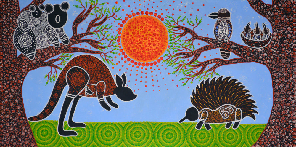
Journey of Happiness (30x60"), April 2019
This piece was commissioned by Harris Park preschool and the brief was to depict the animals that represent each of the classrooms. To me, the different animals represent the following: the kookaburra ‘happiness’, the echidna ‘uniqueness’, the koala ‘calmness’, and the kangaroo or marrawuy ‘a journey/moving forward’ as a kangaroo can’t jump backwards. All these animals represent important concepts to me that I try to embody in my life’s journey.
I love the kookaburra and its unique call that sounds like laughter. Whenever I hear a kookaburra laughing it makes me smile. In life, I have learned that happiness is a journey it’s not a destination and so I find ways to bring happiness to my everyday life. Even something as simple as a kookaburra laughing or a beautiful sunrise or sunset brings me a sense of happiness. I have also learned that it’s important to steer clear from a mindset of thinking happiness will come once an event has occurred e.g. ‘once I achieve X, I’ll be happy or once I have this amount of dollars, I’ll be happy or once I get married and have a family, I’ll be happy etc.’ because with that type of mindset I don’t think happiness will ever be achieved, or last very long, as there will always be something else that needs to happen in order to be happy and therefore happiness will be forever a pursuit and never ‘achieved’. So find ways to bring yourself happiness everyday.
Embrace your uniqueness, like the echidna, a monotreme who challenges the animal kingdom with it being a mammal that lays eggs, everyone is unique and I think it’s important to know, accept and own that. Instead of trying to be someone you think others want you to be and striving for that, standout and embrace your uniqueness and be the person you want to be because that is going to be the you who makes you feel the best in the long run. This is something I have always strived for, I don’t want to be like everyone else, I challenge almost every situation that is considered a norm or tradition. Some find this challenging when I do this but I think it’s important to be disruptive because I believe that is how we evolve.
Embrace the koala’s calmness, especially when in stressful situations as remaining calm will allow you to keep a clear head and take the right course of action for the situation. So when I am experiencing a stressful situation, I take a deep breath or two, endeavour to focus on the positive outcomes that can occur and avoid the negative thoughts - when I find myself slipping to negative thoughts I try to counter it with a positive. Lastly, I remind myself that this current state won’t last forever and there is light at the end of the tunnel.
Lastly, life is a journey and it is going to have its good and tough times so remembering in those tough times to just keep moving forward, one step in front of the other, just like the kangaroo. And in the good times, reveling in that feeling and continuing to move forward as there is always something new to learn and experience.
Elevating to New Heights (30x60"), December 2018
‘Elevating to New Heights’ stems from the fact PwC and PIC have developed an Elevate RAP and with that becoming a leader in the space of reconciliation, and reaching new heights. It ties into my theme of using a tree and how I associate it with growth.
As you view the painting, you are looking at it from a Birds eye view. You see the inside of a tree and its roots. Its roots represent a strong foundation, an enabler for growth which is what has and will continue to happen to PwC & PIC in their reconciliation journey. The roots also represent the diversity of PwC and PIC and its peoples. The important role they play when it comes to working together to achieve their reconciliation vision.
Their reconciliation journey is represented by the growth rings in the tree trunk and the interlocking lines in a continuous run that form the tree trunk represents their ongoing commitment to reconciliation. Lastly, the colours of the background are not just the brand colours but represent a sunrise and with each new sunrise is a chance for new opportunities in this new phase of their reconciliation journey.
Journey of Life (set of two, 30x60"), November 2017
‘Journey of Life’ is a painting that I have done for Palliative Care Australia (PCA). PCA was launched 20 years ago in 1998 and is the national peak body for palliative care. Their mission is to influence, foster and promote the delivery of quality palliative care for all. The brief was to represent life and death but in a bright and comforting way as well as represent PCA.A couple of months later and I have done just that. I have created a piece of artwork that represents the journey of life.
I chose to use a tree as the centre piece of the artwork and have the tree represent a journey. Within the tree are what I consider important life experiences and I sat on this a while trying to determine what is actually important in life but what are some of the hard times that people will experience too. So I started with the positives of life, the good times, and I came up with family, growth, learning, health and love all of which are represented in the bottom panel of the tree.
Family is represented at the bottom of the tree by a baby surrounded by their parents, siblings and grandparents as I believe this is one of the earliest experiences most will encounter and family is an important ongoing aspect in life. As that baby grows to a child to a teenage to adulthood, I considered growth, both physical and mentally, to be important to include and have represented this by using a small plant sprouting. Growth goes side by side with learning. You grow your mind as you learn new information which has been represented by a book. Maintaining good health is also important in life and I have represented this by painting a lifeline. The lifeline is also symbolic of life’s ups and downs.
The next important aspect in life is to keep healthy through exercise and I have represented this by someone running. And of course there is love. Love is represented by two people forming a heart. This isn’t just about finding the ‘one’ love but all love experienced during life and includes love of family and friends.
Now the top part of the tree only shows half the tree, I have done this as I wanted to represent this next part as not something everyone will necessarily experience but is a possible life experience. And that experience is end of life care provided by PCA. I have represented this possible experience by first using part of PCA’s logo to represent PCA. Then as you move along the branch, I represent their commitment through a commitment knot, then the various providers of palliative care using a person with a medical kit. The last illustration is of a patient with their loved one by their side. The inevitable next phase is transitioning to the afterlife and this is represented by two hands forming hands behind a butterfly. The butterfly is a symbol I like to use to reflect transformation or change and in this painting I have used a butterfly to represent that of one passing to the afterlife. I have represented the afterlife in the white corner with outlines of butterflies to represent those that have already passed.
Going back to the main part of the tree, the next stage that many will experience after a loss is grief which I have represented using an eye with tear droplets. Everyone experiences grief differently but will likely go through, and back through, a number of stages including denial, anger, bargaining, depression and acceptance. I am all too familiar with what the various stages feel like. Mid-year, I lost my coach quite suddenly to pancreatic cancer and then a couple of months later my Nan unexpectedly passed on my birthday. Whilst both were extremely painful experiences, without them, I may not have understood or even known about this part of my painting. What I have learned is grief never goes away, you just learn to live with it. You carry a 5kg weight around long enough and you’ll get used to the weight of it that you will begin not to notice it. A friend and mentor who too has experienced grief also verified this concept and said that whilst it never goes away, you will transition from days on end of crying and sadness to more days of happiness and less days of sadness. That is what I have found to be true, most of my days are happy ones but I still become overwhelmed by memories and emotion on a regular basis and I expect this to continue but to become less regular after time.
However what I have also learned from experiencing grief is that I find you experience growth. I have felt that I have grown immensely as a person and value life more than I did six months ago. I am more ambitious and dreaming bigger than I ever have with what I want to achieve because when your times up, it’s up. You are unlikely to have a choice in the matter, so I try to live everyday like it’s my last. So I thought it was important to re-represent growth in the painting but this time by a more developed plant then the earlier version of growth. The last milestone I have represented is opportunities using a compass. Life is full of opportunities and you can’t wait for them to fall into your lap, you need to go searching for them too. I feel, since experiencing grief and my newfound commitment to make the most of my life, I have found myself searching out opportunities instead of waiting for them to be handed to me.
Lastly there are three sections of footprints throughout the two panels and they are representative of a journey through life but also to represent my belief in the circle of life. Because whilst I have experienced two deaths in the last 12 months I have also experienced two births, my cousin and my niece.
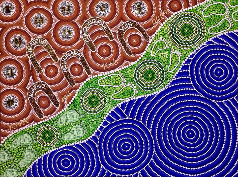
CatholicCare Canberra and Goulburn’s Reconciliation Journey (36x48"), September 2017
This painting was commissioned in August 2017 for use in CatholicCare Canberra & Goulburn (CCG)’s Innovate RAP. The brief I received from CCG was that the artwork should be representative of their organisation and their RAP journey therefore I have produced a piece of artwork that represents aspects relating to CCG’s organisation, their RAP journey and the ripple effect concept.
When I was researching and planning the piece of artwork for CCG, one statement that stood out for me was “We‘re the hands and the eyes, we’re the hearts and minds; we are there, there for any human.” I really wanted to incorporate this message and so I decided to look up the words in Ngyiampaa language. In Ngyiampaa language, hands is Mara, eyes is Mil, heart is Kii and whilst there was no word for ‘minds’ specifically there was Pala which means ‘head’. I thought this was an appropriate substitute.
Other information I wanted to capture in the painting was that CCG’s services cover the extensive coastline, the Snowy Mountains, the rolling hills and flat plains out west and I had these various terrains in mind when deciding the colour palette. CCG provides services on the land of five traditional owners (Ngunnawal People in the ACT, the Gundungurra people to the north, Yuin people to the south, Ngarigo to the South West, and the Wiradjuri people in the North-West). These mobs are represented in the painting by the upside down ‘U’ symbols which is a common Aboriginal symbol used to represent people. I have also tried to place the communities in a way you would find them on a map.
During my research I also noted nine services delivered by CCG and endeavoured to include icons that were representative of them. Some are self-explanatory but I have included explanations for my rational behind each one below:
-Family Support Services (depicted by two parent figures and a small child)
-Counselling Services (depicted by a figure representative of a counsellor who is sitting up straight whilst talking to a patient who is suffering and is represented by them sitting slightly bent over)
-Disability (depicted by a common icon of a person in a wheelchair, whilst acknowledging disability is more broad and not always visible I felt this was the right icon to use nonetheless)
-Aged Care (depicted by a person with a walking stick)
-Mental Health (depicted by a brain)
-Youth (depicted by an adult and a slightly shorter person to indicate being a youth)
-Homelessness (depicted by a person assisting someone homeless get on their feet)
-Alcohol and Other Drugs (depicted by a bottle but an upside down glass to represent the process of giving up alcohol)
-Housing (depicted by a house shape)
The green section represents CCG’s RAP journey. The filled-in footprints indicate what point CCG is currently at in their RAP journey, Innovate, and the steps yet to be taken are represented by the outline of footprints. The section also travels from bottom corner to top right corner to represent moving forward and I wanted to use green as I feel green represents growth but this section also is meant to be representative of the rolling hills mentioned previously. There are four main circles within the green section to represent the four various RAPs an organisation can implement. Keeping in mind each RAP builds on the previous RAP (hence why the circles grow with each RAP) and that the journey to Reconciliation isn’t something that happens overnight. My inspiration to represent these various aspects of the Reconciliation journey and that Reconciliation doesn’t happen overnight was to use the concept of tree growth rings. Each year, the tree forms new cells, arranged in concentric circles called annual rings or annual growth rings and I thought this tied in quite nicely to represent the Reconciliation journey.
As mentioned previously, I wanted to represent the various terrains CCG services and so part of the blue section is to represent the coastline. However my inspiration to represent this section as ripples is from one of my favourite movies as a child, Pocahontas, and one quote that has stuck with me is when Grandmother Willow dips her vine into the water and says “So small at first, then look how they grow. But someone has to start them.” I feel this interpretation ties in quite nicely with the Reconciliation journey because even the smallest steps can lead to greater positive change.
Personal Commissions
We are dedicated to weaving bespoke artworks that embody the essence of your personal or family's distinct narrative, enriching your home with a cherished keepsake. These bespoke pieces can be visual tapestries of your lineage, landmarks, and dreams. Our journey together commences with a heartfelt conversation to delve into your family’s personality, customs, and future visions, infusing the piece with poignant symbols and hues. We blend these intricacies with our signature style, giving life to a piece that enchants and resonates. Through this artistic endeavor, we aspire to forge a centerpiece that nurtures family connections, commemorates ancestry, and becomes an invaluable treasure within your household. Contact us to create an exclusive artwork that beautifully illustrates your personal or family journey.Click through the gallery below to see our past original commissions created for our clients' homes.
Woven Together (36x48inches) July 2025
"Family is a patchwork of love, stitched with patience, bound by choice, and strengthened by understanding."
This piece is a celebration of your blended family - centred on love, connection, and the different paths you each walk.
The title, Woven Together, speaks to the way each of your lives are beautifully threaded through one another. It reflects how your family remains deeply connected, even as each person follows their own path. Like strands in a weaving, the strength comes not from sameness, but from the way your differences come together to form something strong, supportive, and meaningful.
At the heart of the artwork are two central figures, representing you and your husband, surrounded by seven footprints. Each footprint reflects a family member, gently woven into the design to show how you're all connected, even as you grow and journey in your own ways.
The paths flow outward from the centre - crossing over, looping around, and always weaving back together - just like life. Each path carries its own colour, reflecting the individual it represents - just like the footprints. These colours bring personality and presence to the journey, showing how each of you contributes something unique. No matter where the paths lead, they remain part of the same whole, grounded in the love and strength of your family unit.
Throughout the piece, ripples weave through the paths, representing the ongoing influence and presence of each family member within the shared journey. These ripples reflect how memories, love, and support continue to flow through the family, shaping one another as time moves forward.
Woven Together is a visual story of togetherness - acting as a reminder that while each journey is unique, the ties that bind us remain strong.
Tides and Tracks (40x40 inches) April 2025
“Tides and Tracks” represents the strength and connection of family across generations. At its heart are figures and footprints, symbolising a shared journey through time. In the bottom corner, layered patterns symbolise the ocean’s movement - its ever-changing rhythm reflecting the continuity of love and connection that flows through family lines. In contrast, the top corner honours a deep connection to the bushland, where a winding path speaks to each generation’s individual journey - unique, yet always connected. Together, these elements reflect the resilience, growth, and enduring support passed down across time.
Journeys Intertwined (20x30 inches) March 2025
“Journeys Intertwined” captures your journey so far – from your different backgrounds and meeting each other, to the life you've built together and the paths still to come.
The top left represents where you each came from and the moment your lives first intertwined in New Zealand.
The journey continues with your move to Brisbane with the iconic bends of the river flowing through the centre. Footprints mark your time at UQ and QUT with paths that cross towards the place you made home in Greenslopes.
The bottom right reflects where you are now – grounded in Canberra, with new paths unfolding and branching lines representing the possibilities ahead, shaped by everything that’s come before.
“Journeys Intertwined” is a reminder that while life moves and changes, some connections grow stronger with every step.
Connected Through Time
"Connected Through Time" speaks to the continuity of family across generations. The four magpies perched together on the branch represent the unity and bond shared within your family. Two of the magpies, in soft grey, symbolise your children, while the other two represent you and your partner, each magpie embodying the strength of your connection. Below, a small caterpillar makes its way along the branch, quietly representing your loyal dog - steadfast and true. Above, a butterfly flutters gracefully, embodying the enduring love and presence of your mother, ever with you.
The view also serves as a gentle reminder of your place in Canberra, with the magpies that came to visit, offering a connection to the land and its memories. Nestled in the tree branches, the nest cradles the promise of future generations, those who will carry the family legacy forward. Behind it all, the sky, mountains, and trees stand ever-changing, reflecting the transformations of life while remaining rooted in the past.
This piece reflects the journey of family, transformation, and the unbreakable threads that tie us across time.
Reflections of Yesterday, Horizons of Tomorrow (20x30") September 2024
"Reflections of Yesterday, Horizons of Tomorrow" tells the story of a personal journey rich with opportunities, nurturing, and transformation. Beginning at the bottom, the darker hues of the night sky and stars serve as a reminder of the paths and choices that have brought you to this moment, with pink circles symbolising the deep gratitude you hold for each opportunity along the way.
At the heart of the piece, an abstract butterfly takes shape, representing you and your family, including your beloved furbabies. The centre of the butterfly embodies your current self, grounded in where you stand today. Interlocking lines weave through this space, signifying the strong bond with your family while also reflecting your growing commitment to yourself as you step into the next phase of life. Blues, pinks, and yellow/orange tones symbolise the unity, love, and commitment that bind you all together.
As your journey progresses upward, the colours of a sunrise emerge as a powerful symbol of new beginnings and fresh opportunities. The warm tones of the sunrise, combined with green elements and an overlay of blue, reflect the promise of growth and a flourishing path ahead. "Reflections of Yesterday, Horizons of Tomorrow" celebrates the harmony between self-love, transformation, and the unbreakable ties to those you cherish, as you continue to evolve and embrace the boundless possibilities of what’s to come.
Connected Growth (20x30") February 2024
‘Connected Growth’, inspired by my 'Pathway to Growth' piece, reflects on my personal journey and the profound impact of the strong foundations I laid, as well as the detours that shape my ongoing path to growth. Despite the uncertainty of where my journey may lead, each stop along the way is interconnected, contributing to my continuous learning. Trusting and enjoying this pathway to growth has been my greatest lesson.
In ‘Connected Growth’, four trees symbolise David, his wife, and their two girls, subtly connected in the roots and branches. This representation signifies their familial bond while also illustrating their individual journeys of growth.
Family (12x16 inches) August 2023
The painting titled "Family" is inspired by the quote "Family is family, whether it's the one you start out with, the one you end up with, or the family you gain along the way" ~ Gloria Delgado-Pritchett. The painting serves as a reminder of the importance of cherishing and nurturing our family relationships, no matter how they come into being. Its message is one of inclusivity and love, inviting us to embrace the many different forms that family can take, and to cherish the connections that we share with those closest to us. Whether we are born into a family, create one for ourselves, or gain one along the way. This version represents two children, two parents and two sets of grandparents.
Family Connections (24x30"), September 2022
‘Family Connections’ represents Jess’ close connection to her family. Jess is at the centre connected to her parents, brother, and grandparents as well as her husband Mitch. The rivers represent both her ancestry, via her grandparents, and her future pathway with husband Mitch, represented by the interconnected river. The four rivers coming off Jess and Mitch represent each of their individuality and their different interests whilst still moving in the same direction in an interconnected journey.
The green background captures Jess’ love of nature and throughout the greenery are specks of blue and white, grey and white, and browns to represent kookaburras, kangaroos, and wombats. In my artworks, the kookaburra represents happiness, the kangaroo represents progress/moving forward and the wombat represents determination. All animals that I thought tied nicely into Jess’ journey.
In It Together (30x40"), March 2022
In celebration of their April wedding, In It Together represents their individual pasts and the togetherness of their present and future. When I spoke with the client, there was a clear theme of being in it together. From supporting each other with their own personal goals to shared goals and dreams, like travelling Australia together.
Starting at the bottom of the tree, the roots are their individual paths that have guided them towards one another. Whilst the roots look like black and white, they are actually blue and white. When those two colours combine, it creates a lighter blue colour. It is at that transition, which represents the point in time when they found one another and decided to commit to a future together.
The centre of the tree represents their April wedding when their two families come together. Given weddings represent new beginnings, and sunrises to me represent an opportunity for a new beginning, the background is inspired by a sunrise.
Lastly, the intertwined branches are your future and the journeys they will undertake together towards the goals and dreams they share both together and individually. Their children are also captured in these branches, there are four branches that extend out on their own. This represents them following their own journeys, whilst still being connected.
Home Is Where The Heart Is (12x16"), March 2022
This piece represents the client as the butterfly and their family in the body of the butterfly.
The two paths with footprints, represent their journey and no matter where their path takes her, home will always be where her heart is.
The colours of the butterfly represent her Scottish and Australian connections. The white and blue circles in the bottom half of the butterfly represent your Scottish roots, and in the top half, the red, blue and white circles represent her Australian connection.
Lastly, the outside circles represent your extended family and friends.
Family Tree (24x30"), October 2021
‘Family Tree’ was a personal piece commissioned by Meera for her parents Stephen and Padma. It tells the story of their family.
When I spoke to Stephen and Padma about what they wanted the piece to represent, they told me about their love story and challenges they faced. However their love prevailed and together they raised their 5 daughters who now have children of their own.
Where Padma and Stephen live, they are surrounded by kookaburras and so kookaburras were used to represent them (the two kookaburras on the bottom branch), their 5 daughters Meera, Mallika, Suneetha, Sharmila and Urmila are represented by the 5 kookaburras on the next branch. Their grandchildren are represented by the eggs in the nest on the top branch.
Meant To Be (24x30"), October 2021
‘Meant To Be’ is a personal commission for Vaunn and Pamela. It tells their journey of finding each other and their ongoing commitment to each other in their joint journey going forward.
At the bottom of the piece, it represents the universe pushing their two paths together until they finally meet with the sunrise representing this new beginning now that they have found each other. Their togetherness and ongoing commitment to each other is represented by the blue interlocking lines that ripple out. The multiple interlocking lines, represent future experiences they will pass through together.
Family Connection (30x40"), September 2021
‘Family connection’ is a personal commission created for Carolyn and her family. Themes of family and a welcoming home were essential inclusions in this piece. The yellow circles represent their home and family of five. Their family love and welcomeness (the pink in the background, the yellow dots that filter out and the white ripple rings) ripples out to their extended family and friends who come to gather at their family home.
Journey of Change (24x30"), October 2020
"Patriarchy: power over others. Matriarchy: power from within” (Marsden 2018).
Journey of Change represents the need to shift our culture from one that strives for power over each other and over nature, to one of nurturing the natural, social and cultural life based on mutual respect (Goettner-Abendroth cited in Marsden, 2018).
It’s not about oppressing men because men are also negatively impacted by patriarchal ways (Shaikh, 2017).
It's about shifting to a culture where all humans thrive and reach their potential.
This needed shift in our culture is depicted in this piece with a pathway up the centre. As the path begins, it’s clear there is an imbalance however as the path progresses, balance forms. Subtly depicted In the background is a sunrise and this represents the daily opportunity to take action and effect positive change towards balance.
References:
Marsden 2018: Marsden, H 2018, ‘International Women's Day: What are matriarchies, and where are they now?’, Independent, 8 March 2018, viewed 17 October 2020 <https://www.independent.co.uk/news/long_reads/international-womens-day-matriarchy-matriarchal-society-women-feminism-culture-matrilineal-elephant-bonobo-a8243046.html>
Shaikh, 2017: Shaikh, M 2017, ‘3 Ways in Which Men are Victims of Patriarchy (Without Knowing It)’, The Quint, 23 November 2017, viewed 17 October 2020 https://www.thequint.com/neon/gender/how-patriarchy-hurts-men-too-sexual-assault-career-options-emotions
Forever Family (36x48"), May 2020
Phil and my dad worked together back in the day and Phil and Bel saw I was headed to Sydney for Yabun in January 2020 and were keen to meet up and discuss a commission. Unbeknownst to them, my dad was joining me at Yabun that weekend and this provided a great opportunity for my dad and Phil to catch up after a good 25+ years since they last saw each other.
We had so much fun that night and whilst Phil had met me when I was bub I’d never met Bel. The four of us had such a great time topped off with some delicious gelato. Whilst we caught up that night I listened to their journey and what they hoped the piece would represent. Phil and Bel were keen for a custom piece to represent their beautiful blended family and spoke of the use of bright colours and a creek nearby as well as the use of platypus and turtles. It was also important for those family members who had passed to be represented.
The centre of this piece, the water, represents Phil and Bels’ blended family with the use of platypus and long-neck turtles swimming in harmony together. Bel and her two boys, Chris and Ryan, are represented by the long-neck turtles and Phil and his two boys, Dallas and Tristan, are represented by the platypus. Sadly, Tristan passed away in 2018 and his passing is represented by him leaving the water to join his ancestors. Their ancestors and family members who have passed are represented by the footprints with the idea behind the use of footprints on the bank to represent that whilst no longer with us in the same form as us, they will always be with us, walking alongside us.
The Journey of Isabelle & Family (set of two, 20x20"), July 2020
The first two pieces of this set have been especially commissioned by Isabelle who after 15 years in Australia is returning to France with her family. The first two pieces represent her time in Australia and her return journey to France. They were commissioned to compliment the third piece, Growth, which was purchased by Isabelle at the 2019 Yabun festival in Sydney.
The first piece uses the bright colours of the Australian landscape, the blue oceans we are surrounded by, the red earth at our centre and the green rainforests and bushland in between. Within the green are the colours of lorikeets as her Jonathan loves lorikeets who mesmerize him every time he sees them. At the centre is a heart to represent Isabelle and who like me, loves opals and again it was important that we brought them into the piece. Surrounding the heart is a kangaroo, kookaburra and koala that represent the children - Sebastian, Emily and Jonathan connected by the interlocking lines represent a never-ending commitment to the children in the colours of the Australian sun. The black with white dots outlines around her family represent the night sky. Lastly, going across two paintings is a path that represents the family's journey from Australia to France, starting off using the bright colour palette of Australia and slowly transitioning to more neutral shades as the family undertake their journey back to France in the second piece.
Commitment to love (30x40"), December 2019
A special piece for a very special couple. Commitment to love is a piece I have created for my special friend Dana and her husband as a wedding gift.
Dana loves the ocean as does Matt and so I wanted to create a piece that represented that love as well as their ongoing love and commitment to each other. Ongoing commitment is represented by the interlocking lines on the floor of the ocean and their love is represented by the two seahorses at the centre of the piece.
So grateful I was there to share such a special day and wish you both nothing but love and happiness together.
The Journey
Every project begins with a detailed consultation to understand your story, purpose, and goals. We weave your brand’s colours, symbols, and logos into our signature style, creating artwork that is deeply personal and meaningful.
What We Offer
- Understanding your story and what matters to you
- Original artwork creation (painted and digital)
- Launch attendance and creative activations
- RAP Artwork – Visual representations of your Reconciliation Action Plan journey, honouring the history, culture, and contributions of Aboriginal and Torres Strait Islander peoples.
- Flexible Licensing.
Connect
Design
Create
Share
Testimonials
Through the quote, design and print stage Sarah has been really engaging, responsive and easy to deal with. We are thrilled with the completed digital piece ‘Connected in Healing’ that beautifully reflects our connection in healing, listening, walking together and honouring old and new ways of caring.
Our company, MEDITECH, celebrated 20 years in Australia, and Sarah successfully captured the journey by spending time listening to our journey and portraying that journey uniquely in her artwork. We were thrilled with the result and would highly recommend Marrawuy journeys. We hope to use Marrawuy Journeys again in the future.
Engaging with Marrawuy Journeys was easy every step of the way. I commissioned a piece ["Woven Together"] with a few design concepts in mind, but essentially wanting Sarah to interpret this with her own artistic and spiritual input. Sarah took the time to understand what I was looking for, she shared her concept with me to confirm we were aligned and created such a beautiful piece in time for my anniversary. We absolutely love what she has created for us.
I have known and work with Sarah from Marrawuy Journeys now for over ten years across multiple organisations. I have commissioned work and bought both original and printed artworks from her, which hang in offices and in my home. Sarah is both a very talented artist (one of my favourites) as well as a seasoned consultant. As such, when engaging her for a commissioned piece, she really works hard to understand the culture of an organisation and what they're trying to achieve. I cannot recommend her highly enough.
“We are absolutely in love with our commissioned piece — it beautifully captures our story and connection to Australia. Sarah was incredibly patient and attentive throughout the design process, really listening to our story and ideas and bringing them to life in the most beautiful way! We’re beyond thrilled with the final piece!”
“I LOVE IT!!! It’s even better than I imagined. The intricacies of colour are stunning — it’s just beautiful in the light of day.”
Sarah’s art, her workshops, and her business are the full expression of her—colourful, creative, and authentic. Her consulting background has clearly influenced her approach, as she remains deeply client-focused, engaging with and valuing the power of storytelling.
We commissioned Marrawuy Journeys for our first Reconciliation Action Plan (RAP) and were so happy with the results that we reengaged her for our second RAP. Sarah’s willingness to share insights from her Marrawuy Journeys business and highlight the positive impact creativity can have in fostering connectivity and wellbeing is inspiring.
The National Convention Centre Canberra commissioned Sarah to create an artwork that embodies our company values and inspires our future branding and collateral. From our first meeting, Sarah's talent, passion, and dedication were evident. The final artwork and its story proudly reside in our Conference Organisers' office, reflecting the NCCC's vision and values.
We are thrilled with the piece and regularly receive compliments from both clients and staff. Sarah's creativity and guidance throughout the design process were invaluable.
Parbery engaged Sarah to develop the artwork for our first Reconciliation Action Plan (RAP). Sarah met with our RAP working group and really made sure she understood who we are and what we stand for – our origin story and our plans for the future. Ripples of Authenticity truly reflects our story and the impact we want to make through our RAP, and through the broader operations of our business. Sarah is an amazing artist, storyteller, and businesswoman, who made the process of commissioning our artwork simple and stress free. We love our RAP artwork, we would absolutely recommend Sarah, and we would 100% work with Sarah again!
Our experience in commissioning and licencing a beautiful piece of artwork has been perfect. Thank you Sarah for sharing your immense talent to help us tell our story and to utilise your painting in our presentations and documents we create.
We approached Sarah to create a bespoke piece that reflected the mission, values and story behind our organisation. Sarah met with us to discuss our special requirements and put together a proposal that truly reflected our vision. We were consulted regularly throughout the process and final result is truly unique piece has been a huge success with our team. The whole process from end to end was seamless and we couldn’t be happier with our new treasure.
Sarah Richards, First Nation’s artist, Marrawuy Journeys was commissioned by Independent Schools Australia to design an artwork for our Reconciliation Action Plan (RAP). Sarah was very responsive, timely and professional and her artwork is strikingly brilliant. She creatively aligned the artwork for our RAP with our organisation's vision and sense of purpose. Sarah's professionalism was evident in her communication, website, information presented, client and licence agreements. Sarah kept us up to date at key points in the artwork project, providing confidence and building expectation that was certainly fulfilled.
Working with Sarah Richards from Marrawuy Journeys was an exceptional experience. Sarah dedicated herself to understanding our business, capturing our reconciliation journey, and conveying our values through a stunning artwork. Her excellent communication and flexibility made the process seamless. The artwork, now prominently displayed in our reception area, not only serves as a great conversation starter, but also as a powerful testament to our commitment to connection and reconciliation. We highly recommend Sarah for her artistic talent and ability to embody an organisation's essence in her creations.
From the moment I connected with Sarah regarding an artwork I was impressed by her professional approach which made the whole process of purchasing a license and a commissioned artwork incredibly easy as well as reasonably affordable for a small NFP. The creative process was straightforward, Sarah asked just the right questions to get you thinking about what outcome you'd like to see. We are thrilled with the final product which now adorns our office, will appear on our website and will be embroidered on the Australian Science Olympiad team blazers, proudly representing Australia.
We commissioned Sarah to create an artwork for our Reflect RAP. Sarah was an absolute delight to work with and I would highly recommend working with her. Sarah’s briefing process really encouraged us to reflect on who we were as an organisation, the journey, and the outcomes we sought to achieve through our RAP. The resulting artwork is something that our entire team is incredibly proud of.
Sarah has created a wonderful artwork that tells not only our reconciliation journey but our past, present and future company story. Sarah has been wonderful to work with.
Sarah worked with us to create a one-off artwork for display in our new office location. From the start, Sarah was responsive and really took the time to make sure she was across our brief. She provided beautiful progress shots and went above and beyond during the delivery process. Thanks Sarah, we are so happy with our new artwork.
Sarah was great to work with, she took the time to understand my requirements and designed a custom piece that met the needs perfectly. She used a quote and a story that resonates well with the intent of the document she designed it for.
Buying our first family home together, my partner and I decided it would be good to add some artwork. We contacted Sarah for a commission piece and from the start, Sarah made the whole process a breeze. She took the time to get to know our situation and in the end, created the perfect piece that not only suited the theme of our home, but a piece that personally resonated with us as a family.
It was an absolute pleasure working with Sarah through this process and CHN now has a wonderful piece of artwork that showcases our Cultural journey to date and beyond.
We first engaged Sarah to do a commission piece representing both our organisational and reconciliation journey in 2017 and have been exceptionally happy customers ever since. From that very first piece Sarah by far exceeded our expectations. Not only does she produce beautiful original pieces her unique stories she creates to compliment them are always deep, enriching and bring her work to life. We have sourced many pieces from Sarah over the years and thoroughly recommend her to everyone. Sarah is always delightful to work with and is passionate about all that she does.
I would recommend Sarah to any organisation or indeed for personal commissions. She is a delightful human who is passionate about what she does, and is so very easy to work with. She is ethical and is not afraid to challenge people's conceptions of things, in order to reach agreement on commissions. A contemporary Aboriginal artist and woman, who will support your organisation on its journey of reconciliation. I engaged Sarah back in 2017 when I was CEO of Palliative Care Australia and again when I became the CEO of Carers Australia. For both pieces, and the piece that was commissioned personally for me, all were intricate in detail, full of vibrant colours and created in a way that asks the viewer to pause, and to look more closely. Each unique piece has been engaging and the focus in any room, they are simply just beautiful.
Request a Quote
Meaningful artwork that is bespoke to your home or organisation.
For a tailored proposal, please complete the form below.